Benchmarking Commit Logs

In this article, we look at Apache Kafka and NATS Streaming, two messaging systems based on the idea of a commit log. We’ll compare some of the features of both but spend less time talking about Kafka since by now it’s quite well known. Similar to previous studies, we’ll attempt to quantify their general performance characteristics through careful benchmarking.

The purpose of this benchmark is to test drive the newly released NATS Streaming system, which was made generally available just in the last few months. NATS Streaming doesn’t yet support clustering, so we try to put its performance into context by looking at a similar configuration of Kafka.

Unlike conventional message queues, commit logs are an append-only data structure. This results in several nice properties like total ordering of messages, at-least-once delivery, and message-replay semantics. Jay Kreps’ blog post The Log is a great introduction to the concept and particularly why it’s so useful in the context of distributed systems and stream processing (his book I Heart Logs is an extended version of the blog post and is a quick read).

Kafka, which originated at LinkedIn, is by far the most popular and most mature implementation of the commit log (AWS offers their own flavor of it called Kinesis, and imitation is the sincerest form of flattery). It’s billed as a “distributed streaming platform for building real-time data pipelines and streaming apps.” The much newer NATS Streaming is actually a data-streaming layer built on top of Apcera’s high-performance publish-subscribe system NATS. It’s billed as “real-time streaming for Big Data, IoT, Mobile, and Cloud Native Applications.” Both have some similarities as well as some key differences.

Fundamental to the notion of a log is a way to globally order events. Neither NATS Streaming nor Kafka are actually a single log but many logs, each totally ordered using a sequence number or offset, respectively.

In Kafka, topics are partitioned into multiple logs which are then replicated across a number of servers for fault tolerance, making it a distributed commit log. Each partition has a server that acts as the leader. Cluster membership and leader election is managed by ZooKeeper.

NATS Streaming’s topics are called “channels” which are globally ordered. Unlike Kafka, NATS Streaming does not support replication or partitioning of channels, though my understanding is clustering support is slated for Q1 2017. Its message store is pluggable, so it can provide durability using a file-backed implementation, like Kafka, or simply an in-memory store.

NATS Streaming is closer to a hybrid of traditional message queues and the commit log. Like Kafka, it allows replaying the log from a specific offset, the beginning of time, or the newest offset, but it also exposes an API for reading from the log at a specific physical time offset, e.g. all messages from the last 30 seconds. Kafka, on the other hand, only has a notion of logical offsets (correction: Kafka added support for offset lookup by timestamp in 0.10.1.0) . Generally, relying on physical time is an anti-pattern in distributed systems due to clock drift and the fact that clocks are not always monotonic. For example, imagine a situation where a NATS Streaming server is restarted and the clock is changed. Messages are still ordered by their sequence numbers but their timestamps might not reflect that. Developers would need to be aware of this while implementing their business logic.

With Kafka, it’s strictly on consumers to track their offset into the log (or the high-level consumer which stores offsets in ZooKeeper (correction: Kafka itself can now store offsets which is used by the new Consumer API, meaning clients do not have to manage offsets directly or rely on ZooKeeper)). NATS Streaming allows clients to either track their sequence number or use a durable subscription, which causes the server to track the last acknowledged message for a client. If the client restarts, the server will resume delivery starting at the earliest unacknowledged message. This is closer to what you would expect from a traditional message-oriented middleware like RabbitMQ.

Lastly, NATS Streaming supports publisher and subscriber rate limiting. This works by configuring the maximum number of in-flight (unacknowledged) messages either from the publisher to the server or from the server to the subscriber. Starting in version 0.9, Kafka supports a similar rate limiting feature that allows producer and consumer byte-rate thresholds to be defined for groups of clients with its Quotas protocol.

Kafka was designed to avoid tracking any client state on the server for performance and scalability reasons. Throughput and storage capacity scale linearly with the number of nodes. NATS Streaming provides some additional features over Kafka at the cost of some added state on the server. Since clustering isn’t supported, there isn’t really any scale or HA story yet, so it’s unclear how that will play out. That said, once replication is supported, there’s a lot of work going into verifying its correctness (which is a major advantage Kafka has).

Benchmarks

Since NATS Streaming does not support replication at this time (0.3.1), we’ll compare running a single instance of it with file-backed persistence to running a single instance of Kafka (0.10.1.0). We’ll look at both latency and throughput running on commodity hardware (m4.xlarge EC2 instances) with load generation and consumption each running on separate instances. In all of these benchmarks, the systems under test have not been tuned at all and are essentially in their “off-the-shelf” configurations.

We’ll first look at latency by publishing messages of various sizes, ranging from 256 bytes to 1MB, at a fixed rate of 50 messages/second for 30 seconds. Message contents are randomized to account for compression. We then plot the latency distribution by percentile on a logarithmic scale from the 0th percentile to the 99.9999th percentile. Benchmarks are run several times in an attempt to produce a “normalized” result. The benchmark code used is open source.

First, to establish a baseline and later get a feel for the overhead added by the file system, we’ll benchmark NATS Streaming with in-memory storage, meaning messages are not written to disk.

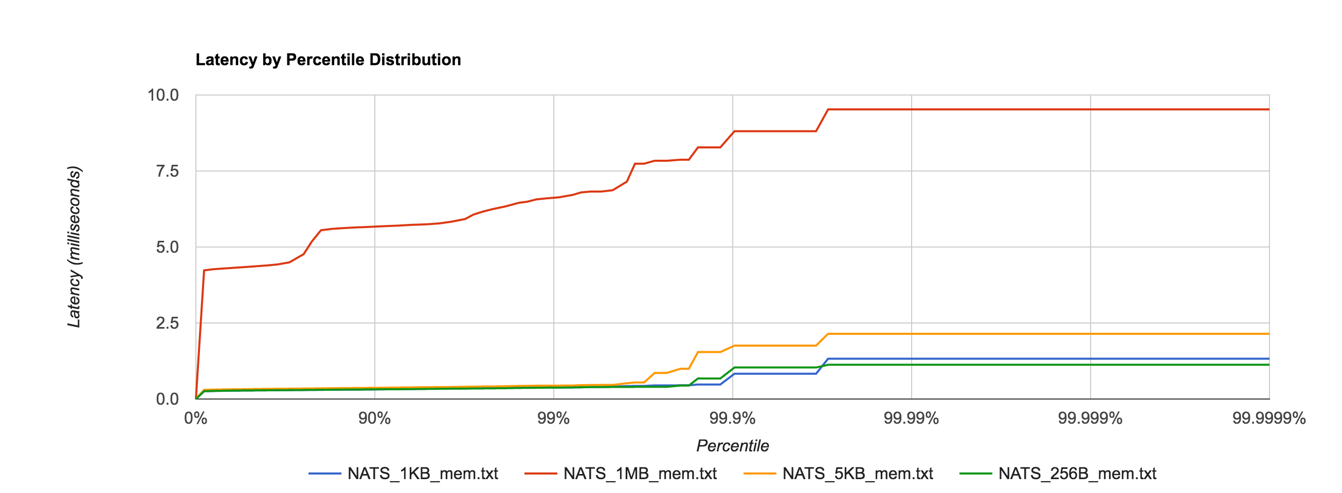
Unsurprisingly, the 1MB configuration has much higher latencies than the other configurations, but everything falls within single-digit-millisecond latencies.nats_mem
NATS Streaming 0.3.1 (in-memory persistence)

 Size 99% 99.9% 99.99% 99.999% 99.9999% 
256B 0.3750ms 1.0367ms 1.1257ms 1.1257ms 1.1257ms
1KB 0.38064ms 0.8321ms 1.3260ms 1.3260ms 1.3260ms
5KB 0.4408ms 1.7569ms 2.1465ms 2.1465ms 2.1465ms
1MB 6.6337ms 8.8097ms 9.5263ms 9.5263ms 9.5263ms

Next, we look at NATS Streaming with file-backed persistence. This provides the same durability guarantees as Kafka running with a replication factor of 1. By default, Kafka stores logs under /tmp. Many Unix distributions mount /tmp to tmpfs which appears as a mounted file system but is actually stored in volatile memory. To account for this and provide as level a playing field as possible, we configure NATS Streaming to also store its logs in /tmp.

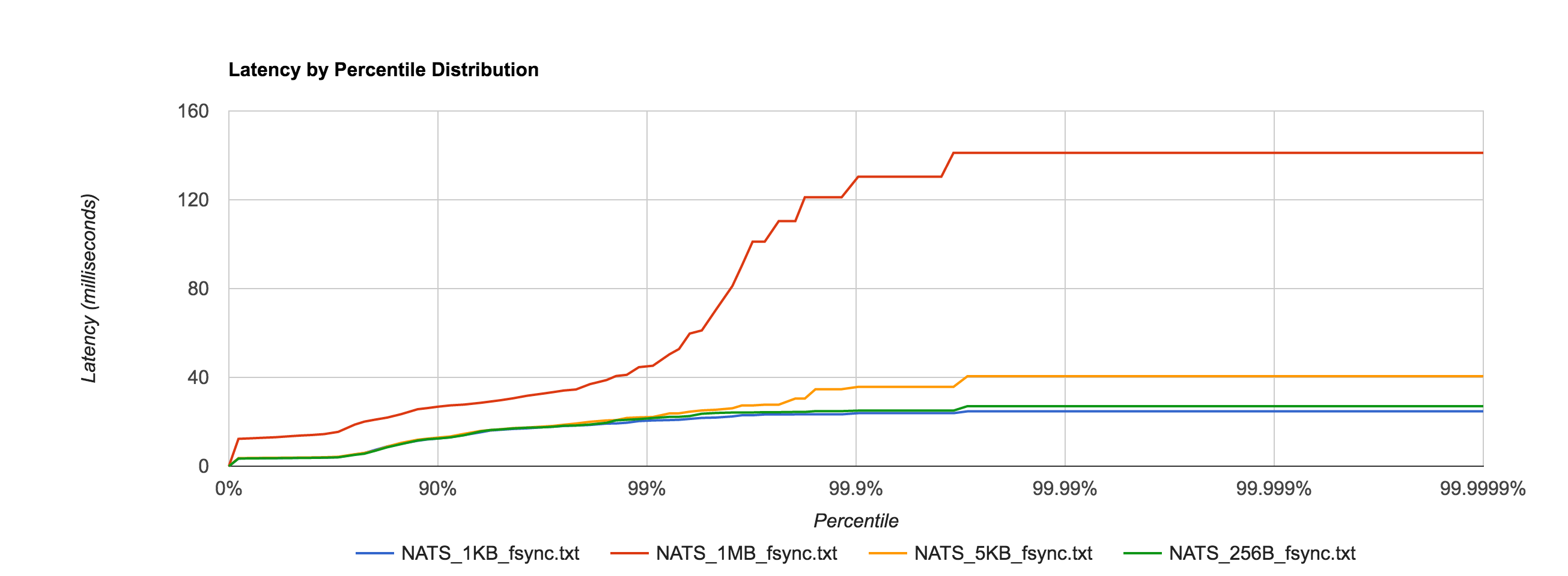
As expected, latencies increase by about an order of magnitude once we start going to disk.

nats_file_fsync

NATS Streaming 0.3.1 (file-backed persistence)

 Size 99% 99.9% 99.99% 99.999% 99.9999% 
256B 21.7051ms 25.0369ms 27.0524ms 27.0524ms 27.0524ms
1KB 20.6090ms 23.8858ms 24.7124ms 24.7124ms 24.7124ms
5KB 22.1692ms 35.7394ms 40.5612ms 40.5612ms 40.5612ms
1MB 45.2490ms 130.3972ms 141.1564ms 141.1564ms 141.1564ms

Since we will be looking at Kafka, there is an important thing to consider relating to fsync behavior. As of version 0.8, Kafka does not call fsync directly and instead relies entirely on the background flush performed by the OS. This is clearly indicated by their documentation:

We recommend using the default flush settings which disable application fsync entirely. This means relying on the background flush done by the OS and Kafka’s own background flush. This provides the best of all worlds for most uses: no knobs to tune, great throughput and latency, and full recovery guarantees. We generally feel that the guarantees provided by replication are stronger than sync to local disk, however the paranoid still may prefer having both and application level fsync policies are still supported.
However, NATS Streaming calls fsync every time a batch is written to disk by default. This can be disabled through the use of the –file_sync flag. By setting this flag to false, we put NATS Streaming’s persistence behavior closer in line with Kafka’s (again assuming a replication factor of 1).

As an aside, the comparison between NATS Streaming and Kafka still isn’t completely “fair”. Jay Kreps points out that Kafka relies on replication as the primary means of durability.

Kafka leaves [fsync] off by default because it relies on replication not fsync for durability, which is generally faster. If you don’t have replication I think you probably need fsync and maybe some kind of high integrity file system.

I don’t think we can provide a truly fair comparison until NATS Streaming supports replication, at which point we will revisit this.

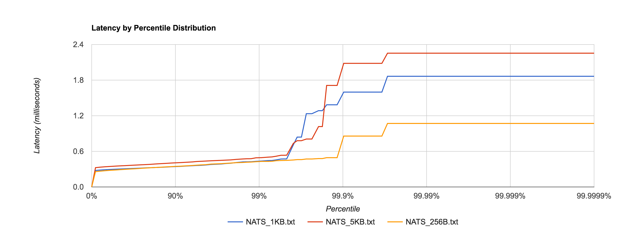
To no one’s surprise, setting –file_sync=false has a significant impact on latency, shown in the distribution below.

nats_file_no_fsync

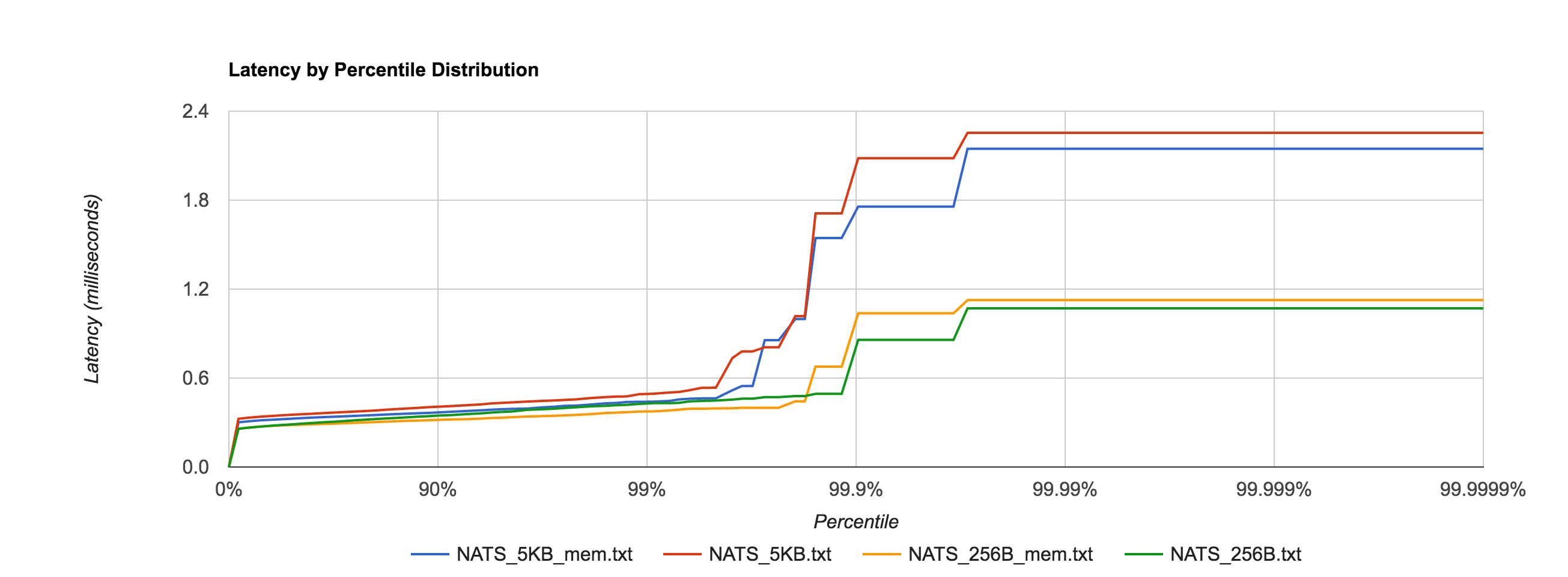
In fact, it’s now in line with the in-memory performance as before for 256B, 1KB, and 5KB messages, shown in the comparison below.

nats_file_mem

For a reason I have yet to figure out, the latency for 1MB messages is roughly an order of magnitude faster when fsync is enabled after the 95th percentile, which seems counterintuitive. If anyone has an explanation, I would love to hear it. I’m sure there’s a good debug story there. The distribution below shows the 1MB configuration for NATS Streaming with and without fsync enabled and just how big the difference is at the 95th percentile and beyond.

nats_file_mem_1mb

NATS Streaming 0.3.1 (file-backed persistence, –file_sync=false)

 Size 99% 99.9% 99.99% 99.999% 99.9999% 
256B 0.4304ms 0.8577ms 1.0706ms 1.0706ms 1.0706ms
1KB 0.4372ms 1.5987ms 1.8651ms 1.8651ms 1.8651ms
5KB 0.4939ms 2.0828ms 2.2540ms 2.2540ms 2.2540ms
1MB 1296.1464ms 1556.1441ms 1596.1457ms 1596.1457ms 1596.1457ms

Kafka with replication factor 1 tends to have higher latencies than NATS Streaming with –file_sync=false. There was one potential caveat here Ivan Kozlovic pointed out to me in that NATS Streaming uses a caching optimization for reads that may put it at an advantage.
Now, there is one side where NATS Streaming *may* be looking better and not fair to Kafka. By default, the file store keeps everything in memory once stored. This means look-ups will be fast. There is only a all-or-nothing mode right now, which means either cache everything or nothing. With caching disabled (–file_cache=false), every lookup will result in disk access (which when you have 1 to many subscribers will be bad). I am working on changing that. But if you do notice that in Kafka, consuming results in a disk read (given the other default behavior described above, they actually may not ;-)., then you could disable NATS Streaming file caching.

Fortunately, we can verify if Kafka is actually going to disk to read messages back from the log during the benchmark using iostat. We see something like this for the majority of the benchmark duration:

avg-cpu:  %user   %nice %system %iowait  %steal   %idle
          13.53    0.00   11.28    0.00    0.00   75.19

Device:    tps   Blk_read/s   Blk_wrtn/s   Blk_read   Blk_wrtn
xvda      0.00         0.00         0.00          0          0

Specifically, we’re interested in Blk_read, which indicates the total number of blocks read. It appears that Kafka does indeed make heavy use of the operating system’s page cache as Blk_wrtn and Blk_read rarely show any activity throughout the entire benchmark. As such, it seems fair to leave NATS Streaming’s –file_cache=true, which is the default.

One interesting point is Kafka offloads much of its caching to the page cache and outside of the JVM heap, clearly in an effort to minimize GC pauses. I’m not clear if the cache Ivan refers to in NATS Streaming is off-heap or not (NATS Streaming is written in Go which, like Java, is a garbage-collected language).

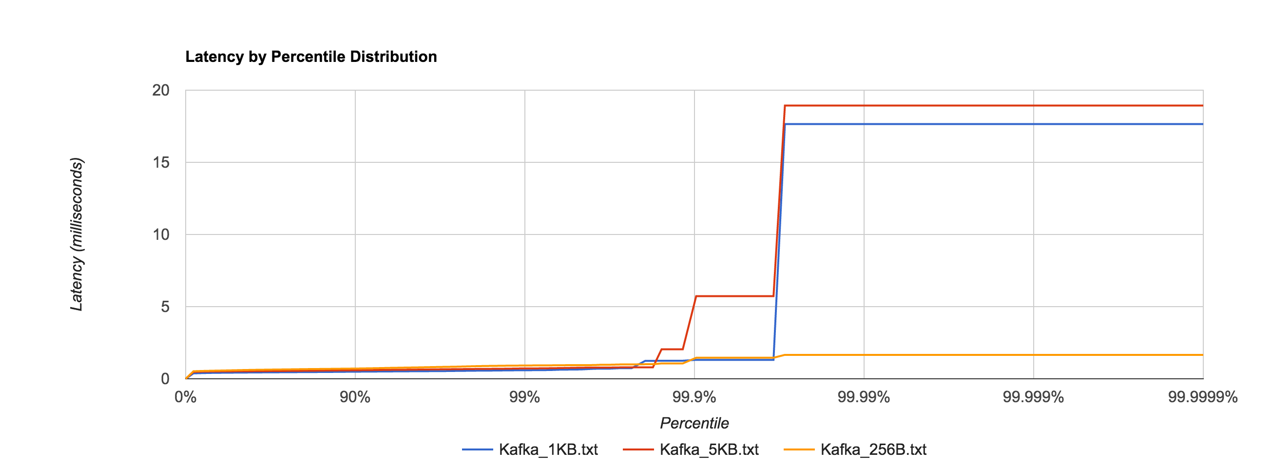
Below is the distribution of latencies for 256B, 1KB, and 5KB configurations in Kafka.

kafka

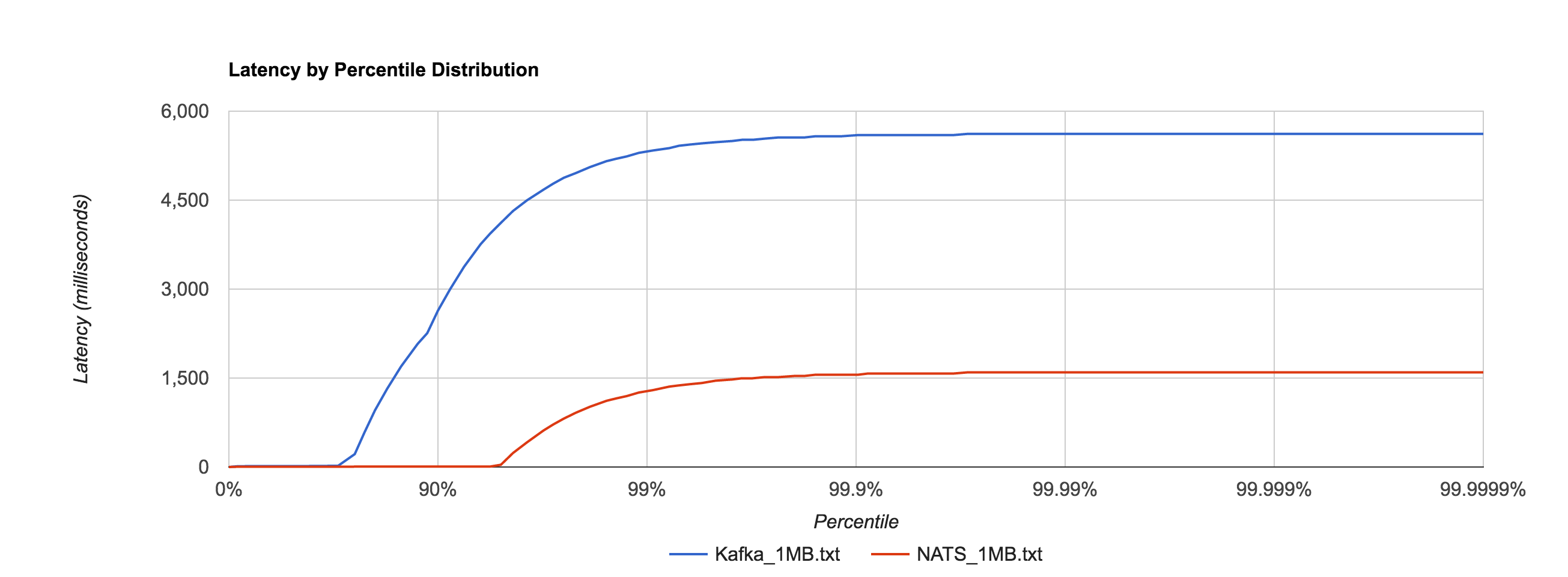
Similar to NATS Streaming, 1MB message latencies tend to be orders of magnitude worse after about the 80th percentile. The distribution below compares the 1MB configuration for NATS Streaming and Kafka.

nats_kafka_1mb

Kafka 0.10.1.0 (replication factor 1)

 Size 99% 99.9% 99.99% 99.999% 99.9999% 
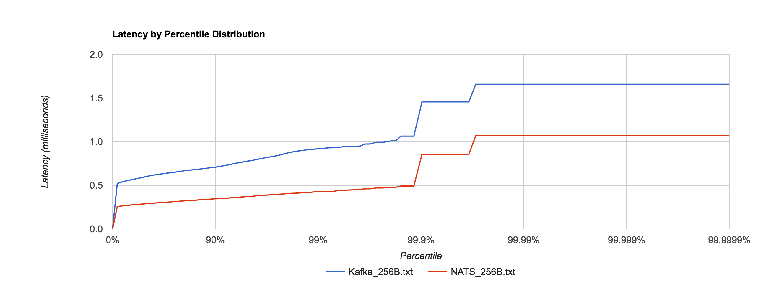
256B 0.9230ms 1.4575ms 1.6596ms 1.6596ms 1.6596ms
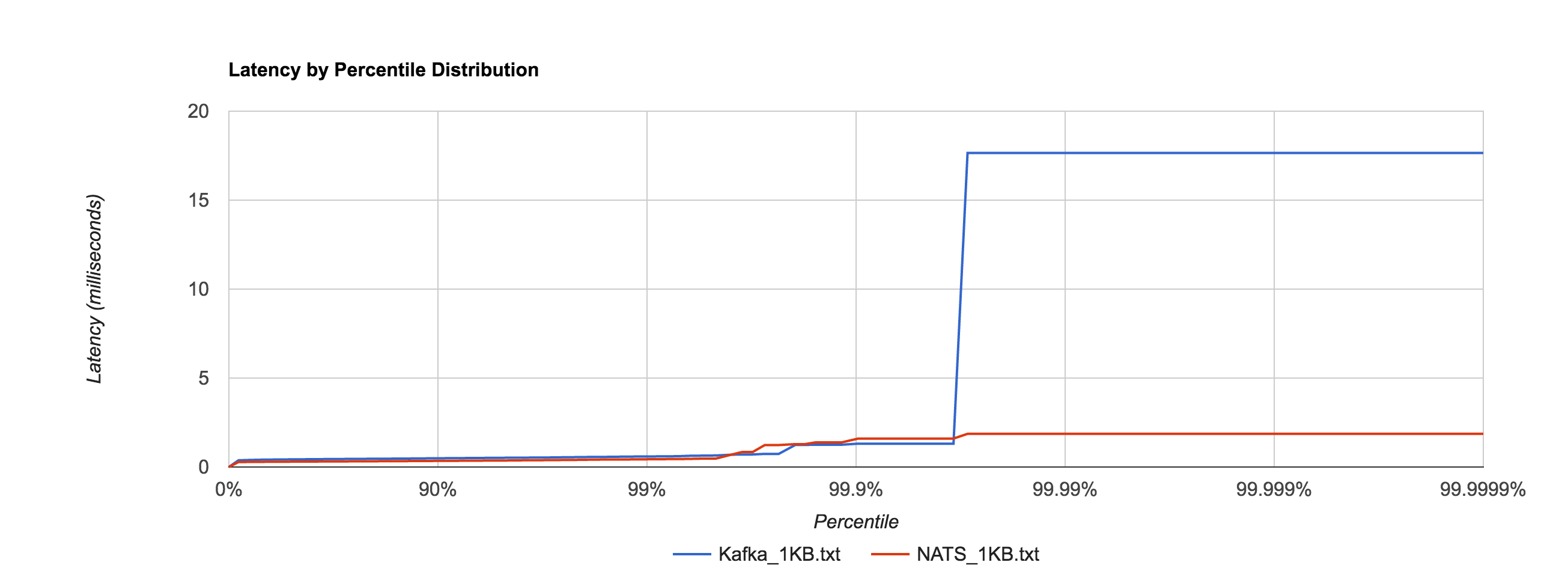
1KB 0.5942ms 1.3123ms 17.6556ms 17.6556ms 17.6556ms
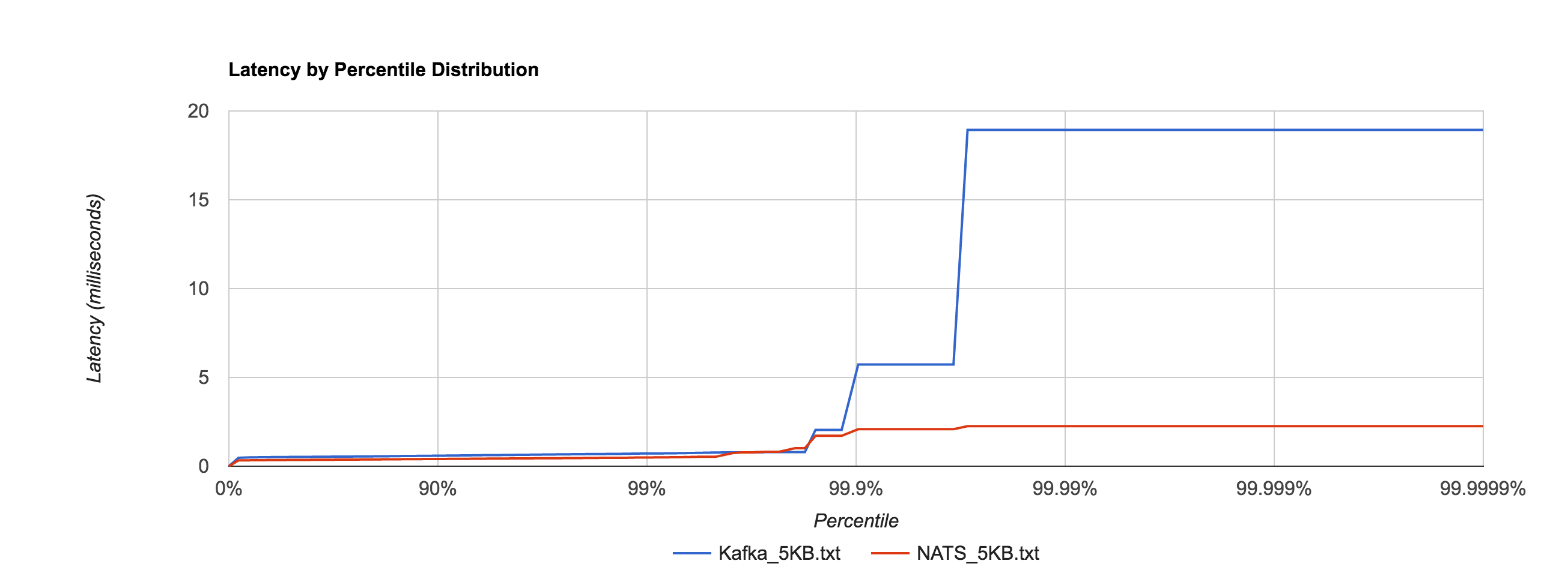
5KB 0.7203ms 5.7236ms 18.9334ms 18.9334ms 18.9334ms
1MB 5337.3174ms 5597.3315ms 5617.3199ms 5617.3199ms 5617.3199ms

The percentile distributions below compare NATS Streaming and Kafka for the 256B, 1KB, and 5KB configurations, respectively.

nats_kafka_256b

nats_kafka_1kb

nats_kafka_5kb

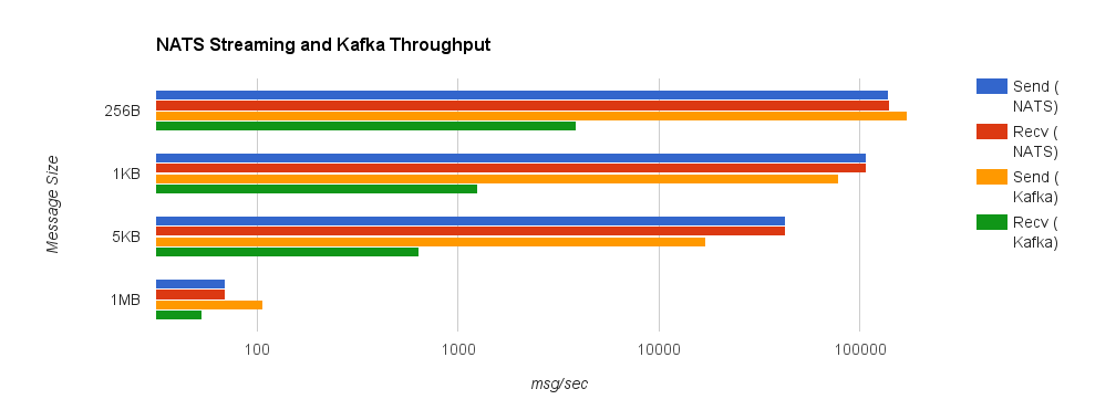
Next, we’ll look at overall throughput for the two systems. This is done by publishing 100,000 messages using the same range of sizes as before and measuring the elapsed time. Specifically, we measure throughput at the publisher and the subscriber.

Despite using an asynchronous publisher in both the NATS Streaming and Kafka benchmarks, we do not consider the publisher “complete” until it has received acks for all published messages from the server. In Kafka, we do this by setting request.required.acks to 1, which means the leader replica has received the data, and consuming the received acks. This is important because the default value is 0, which means the producer never waits for an ack from the broker. In NATS Streaming, we provide an ack callback on every publish. We use the same benchmark configuration as the latency tests, separating load generation and consumption on different EC2 instances. Note the log scale in the following charts.

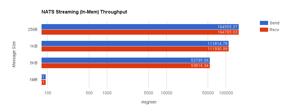
Once again, we’ll start by looking at NATS Streaming using in-memory persistence. The truncated 1MB send and receive throughputs are 93.01 messages/second.

nats_mem_throughput

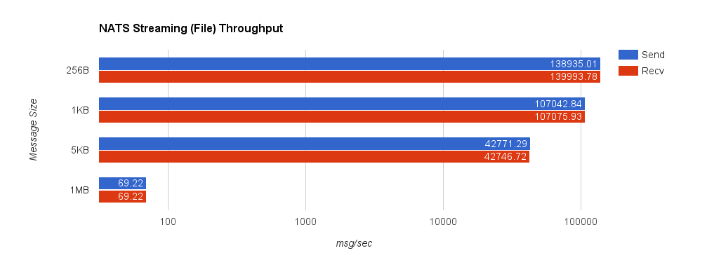
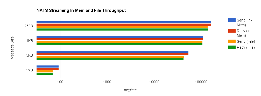
For comparison, we now look at NATS Streaming with file persistence and –file_sync=false. As before, this provides the closest behavior to Kafka’s default flush behavior. The second chart shows a side-by-side comparison between NATS Streaming with in-memory and file persistence.

nats_file_throughput

nats_compare_throughput

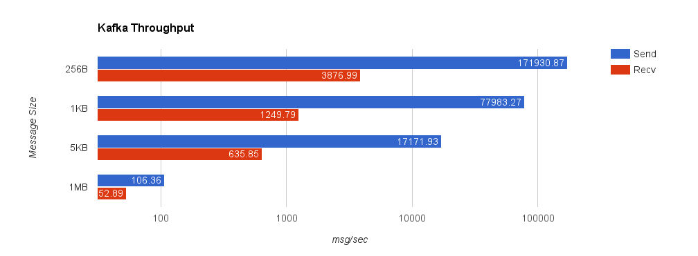
Lastly, we look at Kafka with replication factor 1. Throughput significantly deteriorates when we set request.required.acks = 1 since the producer must wait for all acks from the server. This is important though because, by default, the client does not require an ack from the server. If this were the case, the producer would have no idea how much data actually reached the server once it finished—it could simply be buffered in the client, in flight over the wire, or in the server but not yet on disk. Running the benchmark with request.required.acks = 0 yields much higher throughput on the sender but is basically an exercise in how fast you can write to a channel using the Sarama Go client—slightly misleading.

kafka_throughput

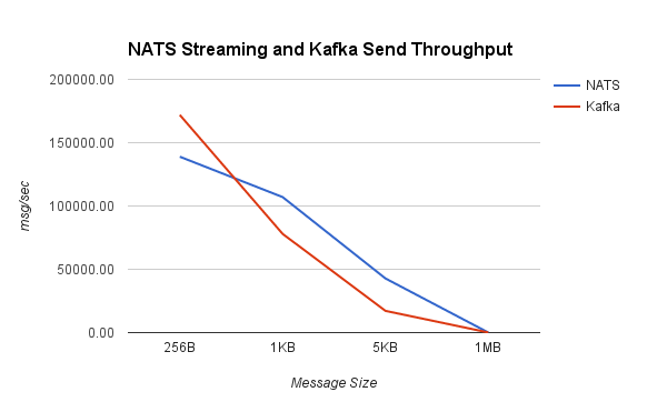
Looking at some comparisons of Kafka and NATS Streaming, we can see that NATS Streaming has higher throughput in all but a few cases.

nats_kafka_throughput

nats_kafka_send_throughput

I want to repeat the disclaimer from before: the purpose of this benchmark is to test drive the newly released NATS Streaming system (which as mentioned earlier, doesn’t yet support clustering), and put its performance into context by looking at a similar configuration of Kafka.

Kafka generally scales very well, so measuring the throughput of a single broker with a single producer and single consumer isn’t particularly meaningful. In reality, we’d be running a cluster with several brokers and partitioning our topics across them.

For as young as it is, NATS Streaming has solid performance (which shouldn’t come as much of a surprise considering the history of NATS itself), and I imagine it will only get better with time as the NATS team continues to optimize. In some ways, NATS Streaming bridges the gap between the commit log as made popular by Kafka and the conventional message queue as made popular by protocols like JMS, AMQP, STOMP, and the like.

The bigger question at this point is how NATS Streaming will tackle scaling and replication (a requirement for true production-readiness in my opinion). Kafka was designed from the ground up for high scalability and availability through the use of external coordination (read ZooKeeper). Naturally, there is a lot of complexity and cost that comes with that. NATS Streaming attempts to keep NATS’ spirit of simplicity, but it’s yet to be seen how it will reconcile that with the complex nature of distributed systems. I’m excited to see where Apcera takes NATS Streaming and generally the NATS ecosystem in the future since the team has a lot of experience in this area.

So You Wanna Go Fast?

I originally proposed this as a GopherCon talk on writing “high-performance Go”, which is why it may seem rambling, incoherent, and—at times—not at all related to Go. The talk was rejected (probably because of the rambling and incoherence), but I still think it’s a subject worth exploring. The good news is, since it was rejected, I can take this where I want. The remainder of this piece is mostly the outline of that talk with some parts filled in, some meandering stories which may or may not pertain to the topic, and some lessons learned along the way. I think it might make a good talk one day, but this will have to do for now.

We work on some interesting things at Workiva—graph traversal, distributed and in-memory calculation engines, low-latency messaging systems, databases optimized for two-dimensional data computation. It turns out, when you want to build a complicated financial-reporting suite with the simplicity and speed of Microsoft Office, and put it entirely in the cloud, you can’t really just plumb some crap together and call it good. It also turns out that when you try to do this, performance becomes kind of important, not because of the complexity of the data—after all, it’s mostly just numbers and formulas—but because of the scale of it. Now, distribute that data in the cloud, consider the security and compliance implications associated with it, add in some collaboration and control mechanisms, and you’ve got yourself some pretty monumental engineering problems.

As I hinted at, performance starts to be really important, whether it’s performing a formula evaluation, publishing a data-change event, or opening up a workbook containing a million rows of data (accountants are weird). A lot of the backend systems powering all of this are, for better or worse, written in Go. Go is, of course, a garbage-collected language, and it compares closely to Java (though the latter has over 20 years invested in it, while the former has about seven).

At this point, you might be asking, “why not C?” It’s honestly a good question to ask, but the reality is there is always history. The first solution was written in Python on Google App Engine (something about MVPs, setting your customers’ expectations low, and giving yourself room to improve?). This was before Go was even a thing, though Java and C were definitely things, but this was a startup. And it was Python. And it was on App Engine. I don’t know exactly what led to those combination of things—I wasn’t there—but, truthfully, App Engine probably played a large role in the company’s early success. Python and App Engine were fast. Not like “this code is fucking fast” fast—what we call performance—more like “we need to get this shit working so we have jobs tomorrow” fast—what we call delivery. I don’t envy that kind of fast, but when you’re a startup trying to disrupt, speed to market matters a hell of a lot more than the speed of your software.

I’ve talked about App Engine at length before. Ultimately, you hit the ceiling of what you can do with it, and you have to migrate off (if you’re a business that is trying to grow, anyway). We hit that migration point at a really weird, uncomfortable time. This was right when Docker was starting to become a thing, and microservices were this thing that everybody was talking about but nobody was doing. Google had been successfully using containers for years, and Netflix was all about microservices. Everybody wanted to be like them, but no one really knew how—but it was the future (unikernels are the new future, by the way).

The problem is—coming from a PaaS like App Engine that does your own laundry—you don’t have the tools, skills, or experience needed to hit the ground running, so you kind of drunkenly stumble your way there. You don’t even have a DevOps team because you didn’t need one! Nobody knew how to use Docker, which is why at the first Dockercon, five people got on stage and presented five solutions to the same problem. It was the blind leading the blind. I love this article by Jesper L. Andersen, How to build stable systems, which contains a treasure trove of practical engineering tips. The very last paragraph of the article reads:

Docker is not mature (Feb 2016). Avoid it in production for now until it matures. Currently Docker is a time sink not fulfilling its promises. This will change over time, so know when to adopt it.

Trying to build microservices using Docker while everyone is stumbling over themselves was, and continues to be, a painful process, exacerbated by the heavy weight suddenly lifted by leaving App Engine. It’s not great if you want to go fast. App Engine made scaling easy by restricting you in what you could do, but once that burden was removed, it was off to the races. What people might not have realized, however, was that App Engine also made distributed systems easy by restricting you in what you could do. Some seem to think the limitations enforced by App Engine are there to make their lives harder or make Google richer (trust me, they’d bill you more if they could), so why would we have similar limitations in our own infrastructure? App Engine makes these limitations, of course, so that it can actually scale. Don’t take that for granted.

App Engine was stateless, so the natural tendency once you’re off it was to make everything stateful. And we did. What I don’t think we realized was that we were, in effect, trading one type of fast for the other—performance for delivery. We can build software that’s fast and runs on your desktop PC like in the 90’s, but now you want to put that in the cloud and make it scale? It takes a big infrastructure investment. It also takes a big time investment. Neither of which are good if you want to go fast, especially when you’re using enough microservices, Docker, and Go to rattle the Hacker News fart chamber. You kind of get caught in this endless rut of innovation that you almost lose your balance. Leaving the statelessness of App Engine for more stateful pastures was sort of like an infant learning to walk. You look down and it dawns on you—you have legs! So you run with it, because that’s amazing, and you stumble spectacularly a few times along the way. Finally, you realize maybe running full speed isn’t the best idea for someone who just learned to walk.

We were also making this transition while Go had started reaching critical mass. Every other headline in the tech aggregators was “why we switched to Go and you should too.” And we did. I swear this post has a point.

Tips for Writing High-Performance Go

By now, I’ve forgotten what I was writing about, but I promised this post was about Go. It is, and it’s largely about performance fast, not delivery fast—the two are often at odds with each other. Everything up until this point was mostly just useless context and ranting. But it also shows you that we are solving some hard problems and why we are where we are. There is always history.

I work with a lot of smart people. Many of us have a near obsession with performance, but the point I was attempting to make earlier is we’re trying to push the boundaries of what you can expect from cloud software. App Engine had some rigid boundaries, so we made a change. Since adopting Go, we’ve learned a lot about how to make things fast and how to make Go work in the world of systems programming.

Go’s simplicity and concurrency model make it an appealing choice for backend systems, but the larger question is how does it fare for latency-sensitive applications? Is it worth sacrificing the simplicity of the language to make it faster? Let’s walk through a few areas of performance optimization in Go—namely language features, memory management, and concurrency—and try to make that determination. All of the code for the benchmarks presented here are available on GitHub.

Channels

Channels in Go get a lot of attention because they are a convenient concurrency primitive, but it’s important to be aware of their performance implications. Usually the performance is “good enough” for most cases, but in certain latency-critical situations, they can pose a bottleneck. Channels are not magic. Under the hood, they are just doing locking. This works great in a single-threaded application where there is no lock contention, but in a multithreaded environment, performance significantly degrades. We can mimic a channel’s semantics quite easily using a lock-free ring buffer.

The first benchmark looks at the performance of a single-item-buffered channel and ring buffer with a single producer and single consumer. First, we look at the performance in the single-threaded case (GOMAXPROCS=1).

BenchmarkChannel 3000000 512 ns/op
BenchmarkRingBuffer 20000000 80.9 ns/op

As you can see, the ring buffer is roughly six times faster (if you’re unfamiliar with Go’s benchmarking tool, the first number next to the benchmark name indicates the number of times the benchmark was run before giving a stable result). Next, we look at the same benchmark with GOMAXPROCS=8.

BenchmarkChannel-8 3000000 542 ns/op
BenchmarkRingBuffer-8 10000000 182 ns/op

The ring buffer is almost three times faster.

Channels are often used to distribute work across a pool of workers. In this benchmark, we look at performance with high read contention on a buffered channel and ring buffer. The GOMAXPROCS=1 test shows how channels are decidedly better for single-threaded systems.

BenchmarkChannelReadContention 10000000 148 ns/op
BenchmarkRingBufferReadContention 10000 390195 ns/op

However, the ring buffer is faster in the multithreaded case:

BenchmarkChannelReadContention-8 1000000 3105 ns/op
BenchmarkRingBufferReadContention-8 3000000 411 ns/op

Lastly, we look at performance with contention on both the reader and writer. Again, the ring buffer’s performance is much worse in the single-threaded case but better in the multithreaded case.

BenchmarkChannelContention 10000 160892 ns/op
BenchmarkRingBufferContention 2 806834344 ns/op
BenchmarkChannelContention-8 5000 314428 ns/op
BenchmarkRingBufferContention-8 10000 182557 ns/op

The lock-free ring buffer achieves thread safety using only CAS operations. We can see that deciding to use it over the channel depends largely on the number of OS threads available to the program. For most systems, GOMAXPROCS > 1, so the lock-free ring buffer tends to be a better option when performance matters. Channels are a rather poor choice for performant access to shared state in a multithreaded system.

Defer

Defer is a useful language feature in Go for readability and avoiding bugs related to releasing resources. For example, when we open a file to read, we need to be careful to close it when we’re done. Without defer, we need to ensure the file is closed at each exit point of the function.

This is really error-prone since it’s easy to miss a return point. Defer solves this problem by effectively adding the cleanup code to the stack and invoking it when the enclosing function returns.

At first glance, one would think defer statements could be completely optimized away by the compiler. If I defer something at the beginning of a function, simply insert the closure at each point the function returns. However, it’s more complicated than this. For example, we can defer a call within a conditional statement or a loop. The first case might require the compiler to track the condition leading to the defer. The compiler would also need to be able to determine if a statement can panic since this is another exit point for a function. Statically proving this seems to be, at least on the surface, an undecidable problem.

The point is defer is not a zero-cost abstraction. We can benchmark it to show the performance overhead. In this benchmark, we compare locking a mutex and unlocking it with a defer in a loop to locking a mutex and unlocking it without defer.

BenchmarkMutexDeferUnlock-8 20000000 96.6 ns/op
BenchmarkMutexUnlock-8 100000000 19.5 ns/op

Using defer is almost five times slower in this test. To be fair, we’re looking at a difference of 77 nanoseconds, but in a tight loop on a critical path, this adds up. One trend you’ll notice with these optimizations is it’s usually up to the developer to make a trade-off between performance and readability. Optimization rarely comes free.

Reflection and JSON

Reflection is generally slow and should be avoided for latency-sensitive applications. JSON is a common data-interchange format, but Go’s encoding/json package relies on reflection to marshal and unmarshal structs. With ffjson, we can use code generation to avoid reflection and benchmark the difference.

BenchmarkJSONReflectionMarshal-8 200000 7063 ns/op
BenchmarkJSONMarshal-8 500000 3981 ns/op

BenchmarkJSONReflectionUnmarshal-8 200000 9362 ns/op
BenchmarkJSONUnmarshal-8 300000 5839 ns/op

Code-generated JSON is about 38% faster than the standard library’s reflection-based implementation. Of course, if we’re concerned about performance, we should really avoid JSON altogether. MessagePack is a better option with serialization code that can also be generated. In this benchmark, we use the msgp library and compare its performance to JSON.

BenchmarkMsgpackMarshal-8 3000000 555 ns/op
BenchmarkJSONReflectionMarshal-8 200000 7063 ns/op
BenchmarkJSONMarshal-8 500000 3981 ns/op

BenchmarkMsgpackUnmarshal-8 20000000 94.6 ns/op
BenchmarkJSONReflectionUnmarshal-8 200000 9362 ns/op
BenchmarkJSONUnmarshal-8 300000 5839 ns/op

The difference here is dramatic. Even when compared to the generated JSON serialization code, MessagePack is significantly faster.

If we’re really trying to micro-optimize, we should also be careful to avoid using interfaces, which have some overhead not just with marshaling but also method invocations. As with other kinds of dynamic dispatch, there is a cost of indirection when performing a lookup for the method call at runtime. The compiler is unable to inline these calls.

BenchmarkJSONReflectionUnmarshal-8 200000 9362 ns/op
BenchmarkJSONReflectionUnmarshalIface-8 200000 10099 ns/op

We can also look at the overhead of the invocation lookup, I2T, which converts an interface to its backing concrete type. This benchmark calls the same method on the same struct. The difference is the second one holds a reference to an interface which the struct implements.

BenchmarkStructMethodCall-8 2000000000 0.44 ns/op
BenchmarkIfaceMethodCall-8 1000000000 2.97 ns/op

Sorting is a more practical example that shows the performance difference. In this benchmark, we compare sorting a slice of 1,000,000 structs and 1,000,000 interfaces backed by the same struct. Sorting the structs is nearly 92% faster than sorting the interfaces.

BenchmarkSortStruct-8 10 105276994 ns/op
BenchmarkSortIface-8 5 286123558 ns/op

To summarize, avoid JSON if possible. If you need it, generate the marshaling and unmarshaling code. In general, it’s best to avoid code that relies on reflection and interfaces and instead write code that uses concrete types. Unfortunately, this often leads to a lot of duplicated code, so it’s best to abstract this with code generation. Once again, the trade-off manifests.

Memory Management

Go doesn’t actually expose heap or stack allocation directly to the user. In fact, the words “heap” and “stack” do not appear anywhere in the language specification. This means anything pertaining to the stack and heap are technically implementation-dependent. In practice, of course, Go does have a stack per goroutine and a heap. The compiler does escape analysis to determine if an object can live on the stack or needs to be allocated in the heap.

Unsurprisingly, avoiding heap allocations can be a major area of optimization. By allocating on the stack, we avoid expensive malloc calls, as the benchmark below shows.

BenchmarkAllocateHeap-8 20000000 62.3 ns/op 96 B/op 1 allocs/op
BenchmarkAllocateStack-8 100000000 11.6 ns/op 0 B/op 0 allocs/op

Naturally, passing by reference is faster than passing by value since the former requires copying only a pointer while the latter requires copying values. The difference is negligible with the struct used in these benchmarks, though it largely depends on what has to be copied. Keep in mind there are also likely some compiler optimizations being performed in this synthetic benchmark.

BenchmarkPassByReference-8 1000000000 2.35 ns/op
BenchmarkPassByValue-8 200000000 6.36 ns/op

However, the larger issue with heap allocation is garbage collection. If we’re creating lots of short-lived objects, we’ll cause the GC to thrash. Object pooling becomes quite important in these scenarios. In this benchmark, we compare allocating structs in 10 concurrent goroutines on the heap vs. using a sync.Pool for the same purpose. Pooling yields a 5x improvement.

BenchmarkConcurrentStructAllocate-8 5000000 337 ns/op
BenchmarkConcurrentStructPool-8 20000000 65.5 ns/op

It’s important to point out that Go’s sync.Pool is drained during garbage collection. The purpose of sync.Pool is to reuse memory between garbage collections. One can maintain their own free list of objects to hold onto memory across garbage collection cycles, though this arguably subverts the purpose of a garbage collector. Go’s pprof tool is extremely useful for profiling memory usage. Use it before blindly making memory optimizations.

False Sharing

When performance really matters, you have to start thinking at the hardware level. Formula One driver Jackie Stewart is famous for once saying, “You don’t have to be an engineer to be be a racing driver, but you do have to have mechanical sympathy.” Having a deep understanding of the inner workings of a car makes you a better driver. Likewise, having an understanding of how a computer actually works makes you a better programmer. For example, how is memory laid out? How do CPU caches work? How do hard disks work?

Memory bandwidth continues to be a limited resource in modern CPU architectures, so caching becomes extremely important to prevent performance bottlenecks. Modern multiprocessor CPUs cache data in small lines, typically 64 bytes in size, to avoid expensive trips to main memory. A write to a piece of memory will cause the CPU cache to evict that line to maintain cache coherency. A subsequent read on that address requires a refresh of the cache line. This is a phenomenon known as false sharing, and it’s especially problematic when multiple processors are accessing independent data in the same cache line.

Imagine a struct in Go and how it’s laid out in memory. Let’s use the ring buffer from earlier as an example. Here’s what that struct might normally look like:

The queue and dequeue fields are used to determine producer and consumer positions, respectively. These fields, which are both eight bytes in size, are concurrently accessed and modified by multiple threads to add and remove items from the queue. Since these two fields are positioned contiguously in memory and occupy only 16 bytes of memory, it’s likely they will stored in a single CPU cache line. Therefore, writing to one will result in evicting the other, meaning a subsequent read will stall. In more concrete terms, adding or removing things from the ring buffer will cause subsequent operations to be slower and will result in lots of thrashing of the CPU cache.

We can modify the struct by adding padding between fields. Each padding is the width of a single CPU cache line to guarantee the fields end up in different lines. What we end up with is the following:

How big a difference does padding out CPU cache lines actually make? As with anything, it depends. It depends on the amount of multiprocessing. It depends on the amount of contention. It depends on memory layout. There are many factors to consider, but we should always use data to back our decisions. We can benchmark operations on the ring buffer with and without padding to see what the difference is in practice.

First, we benchmark a single producer and single consumer, each running in a goroutine. With this test, the improvement between padded and unpadded is fairly small, about 15%.

BenchmarkRingBufferSPSC-8 10000000 156 ns/op
BenchmarkRingBufferPaddedSPSC-8 10000000 132 ns/op

However, when we have multiple producers and multiple consumers, say 100 each, the difference becomes slightly more pronounced. In this case, the padded version is about 36% faster.

BenchmarkRingBufferMPMC-8 100000 27763 ns/op
BenchmarkRingBufferPaddedMPMC-8 100000 17860 ns/op

False sharing is a very real problem. Depending on the amount of concurrency and memory contention, it can be worth introducing padding to help alleviate its effects. These numbers might seem negligible, but they start to add up, particularly in situations where every clock cycle counts.

Lock-Freedom

Lock-free data structures are important for fully utilizing multiple cores. Considering Go is targeted at highly concurrent use cases, it doesn’t offer much in the way of lock-freedom. The encouragement seems to be largely directed towards channels and, to a lesser extent, mutexes.

That said, the standard library does offer the usual low-level memory primitives with the atomic package. Compare-and-swap, atomic pointer access—it’s all there. However, use of the atomic package is heavily discouraged:

We generally don’t want sync/atomic to be used at all…Experience has shown us again and again that very very few people are capable of writing correct code that uses atomic operations…If we had thought of internal packages when we added the sync/atomic package, perhaps we would have used that. Now we can’t remove the package because of the Go 1 guarantee.

How hard can lock-free really be though? Just rub some CAS on it and call it a day, right? After a sufficient amount of hubris, I’ve come to learn that it’s definitely a double-edged sword. Lock-free code can get complicated in a hurry. The atomic and unsafe packages are not easy to use, at least not at first. The latter gets its name for a reason. Tread lightly—this is dangerous territory. Even more so, writing lock-free algorithms can be tricky and error-prone. Simple lock-free data structures, like the ring buffer, are pretty manageable, but anything more than that starts to get hairy.

The Ctrie, which I wrote about in detail, was my foray into the world of lock-free data structures beyond your standard fare of queues and lists. Though the theory is reasonably understandable, the implementation is thoroughly complex. In fact, the complexity largely stems from the lack of a native double compare-and-swap, which is needed to atomically compare indirection nodes (to detect mutations on the tree) and node generations (to detect snapshots taken of the tree). Since no hardware provides such an operation, it has to be simulated using standard primitives (and it can).

The first Ctrie implementation was actually horribly broken, and not even because I was using Go’s synchronization primitives incorrectly. Instead, I had made an incorrect assumption about the language. Each node in a Ctrie has a generation associated with it. When a snapshot is taken of the tree, its root node is copied to a new generation. As nodes in the tree are accessed, they are lazily copied to the new generation (à la persistent data structures), allowing for constant-time snapshotting. To avoid integer overflow, we use objects allocated on the heap to demarcate generations. In Go, this is done using an empty struct. In Java, two newly constructed Objects are not equivalent when compared since their memory addresses will be different. I made a blind assumption that the same was true in Go, when in fact, it’s not. Literally the last paragraph of the Go language specification reads:

A struct or array type has size zero if it contains no fields (or elements, respectively) that have a size greater than zero. Two distinct zero-size variables may have the same address in memory.

Oops. The result was that two different generations were considered equivalent, so the double compare-and-swap always succeeded. This allowed snapshots to potentially put the tree in an inconsistent state. That was a fun bug to track down. Debugging highly concurrent, lock-free code is hell. If you don’t get it right the first time, you’ll end up sinking a ton of time into fixing it, but only after some really subtle bugs crop up. And it’s unlikely you get it right the first time. You win this time, Ian Lance Taylor.

But wait! Obviously there’s some payoff with complicated lock-free algorithms or why else would one subject themselves to this? With the Ctrie, lookup performance is comparable to a synchronized map or a concurrent skip list. Inserts are more expensive due to the increased indirection. The real benefit of the Ctrie is its scalability in terms of memory consumption, which, unlike most hash tables, is always a function of the number of keys currently in the tree. The other advantage is its ability to perform constant-time, linearizable snapshots. We can compare performing a “snapshot” on a synchronized map concurrently in 100 different goroutines with the same test using a Ctrie:

BenchmarkConcurrentSnapshotMap-8 1000 9941784 ns/op
BenchmarkConcurrentSnapshotCtrie-8 20000 90412 ns/op

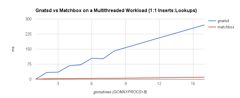
Depending on access patterns, lock-free data structures can offer better performance in multithreaded systems. For example, the NATS message bus uses a synchronized map-based structure to perform subscription matching. When compared with a Ctrie-inspired, lock-free structure, throughput scales a lot better. The blue line is the lock-based data structure, while the red line is the lock-free implementation.

matchbox_bench_1_1

Avoiding locks can be a boon depending on the situation. The advantage was apparent when comparing the ring buffer to the channel. Nonetheless, it’s important to weigh any benefit against the added complexity of the code. In fact, sometimes lock-freedom doesn’t provide any tangible benefit at all!

A Note on Optimization

As we’ve seen throughout this post, performance optimization almost always comes with a cost. Identifying and understanding optimizations themselves is just the first step. What’s more important is understanding when and where to apply them. The famous quote by C. A. R. Hoare, popularized by Donald Knuth, has become a longtime adage of programmers:

The real problem is that programmers have spent far too much time worrying about efficiency in the wrong places and at the wrong times; premature optimization is the root of all evil (or at least most of it) in programming.

Though the point of this quote is not to eliminate optimization altogether, it’s to learn how to strike a balance between speeds—speed of an algorithm, speed of delivery, speed of maintenance, speed of a system. It’s a highly subjective topic, and there is no single rule of thumb. Is premature optimization the root of all evil? Should I just make it work, then make it fast? Does it need to be fast at all? These are not binary decisions. For example, sometimes making it work then making it fast is impossible if there is a fundamental problem in the design.

However, I will say focus on optimizing along the critical path and outward from that only as necessary. The further you get from that critical path, the more likely your return on investment is to diminish and the more time you end up wasting. It’s important to identify what adequate performance is. Do not spend time going beyond that point. This is an area where data-driven decisions are key—be empirical, not impulsive. More important, be practical. There’s no use shaving nanoseconds off of an operation if it just doesn’t matter. There is more to going fast than fast code.

Wrapping Up

If you’ve made it this far, congratulations, there might be something wrong with you. We’ve learned that there are really two kinds of fast in software—delivery and performance.  Customers want the first, developers want the second, and CTOs want both. The first is by far the most important, at least when you’re trying to go to market. The second is something you need to plan for and iterate on. Both are usually at odds with each other.

Perhaps more interestingly, we looked at a few ways we can eke out that extra bit of performance in Go and make it viable for low-latency systems. The language is designed to be simple, but that simplicity can sometimes come at a price. Like the trade-off between the two fasts, there is a similar trade-off between code lifecycle and code performance. Speed comes at the cost of simplicity, at the cost of development time, and at the cost of continued maintenance. Choose wisely.

Benchmarking Message Queue Latency

About a year and a half ago, I published Dissecting Message Queues, which broke down a few different messaging systems and did some performance benchmarking. It was a naive attempt and had a lot of problems, but it was also my first time doing any kind of system benchmarking. It turns out benchmarking systems correctly is actually pretty difficult and many folks get it wrong. I don’t claim to have gotten it right, but over the past year and a half I’ve learned a lot, tried to build some better tools, and improve my methodology.

Tooling and Methodology

The Dissecting Message Queues benchmarks used a framework I wrote which published a specified number of messages effectively as fast as possible, received them, and recorded the end-to-end latency. There are several problems with this. First, load generation and consumption run on the same machine. Second, the system under test runs on the same machine as the benchmark client—both of these confound measurements. Third, running “pedal to the metal” and looking at the resulting latency isn’t a very useful benchmark because it’s not representative of a production environment (as Gil Tene likes to say, this is like driving your car as fast as possible, crashing it into a pole, and looking at the shape of the bumper afterwards—it’s always going to look bad). Lastly, the benchmark recorded average latency, which, for all intents and purposes, is a useless metric to look at.

I wrote Flotilla to automate “scaled-up” benchmarking—running the broker and benchmark clients on separate, distributed VMs. Flotilla also attempted to capture a better view of latency by looking at the latency distribution, though it only went up to the 99th percentile, which can sweep a lot of really bad things under the rug as we’ll see later. However, it still ran tests at full throttle, which isn’t great.

Bench is an attempt to get back to basics. It’s a simple, generic benchmarking library for measuring latency. It provides a straightforward Requester interface which can be implemented for various systems under test. Bench works by attempting to issue a fixed rate of requests per second and measuring the latency of each request issued synchronously. Latencies are captured using HDR Histogram, which observes the complete latency distribution and allows us to look, for example, at “six nines” latency.

Introducing a request schedule allows us to measure latency for different configurations of request rate and message size, but in a “closed-loop” test, it creates another problem called coordinated omission. The problem with a lot of benchmarks is that they end up measuring service time rather than response time, but the latter is likely what you care about because it’s what your users experience.

The best way to describe service time vs. response time is to think of a cash register. The cashier might be able to ring up a customer in under 30 seconds 99% of the time, but 1% of the time it takes three minutes. The time it takes to ring up a customer is the service time, while the response time consists of the service time plus the time the customer waited in line. Thus, the response time is dependent upon the variation in both service time and the rate of arrival. When we measure latency, we really want to measure response time.

Now, let’s think about how most latency benchmarks work. They usually do this:

  1. Note timestamp before request, t0.
  2. Make synchronous request.
  3. Note timestamp after request, t1.
  4. Record latency t1t0.
  5. Repeat as needed for request schedule.

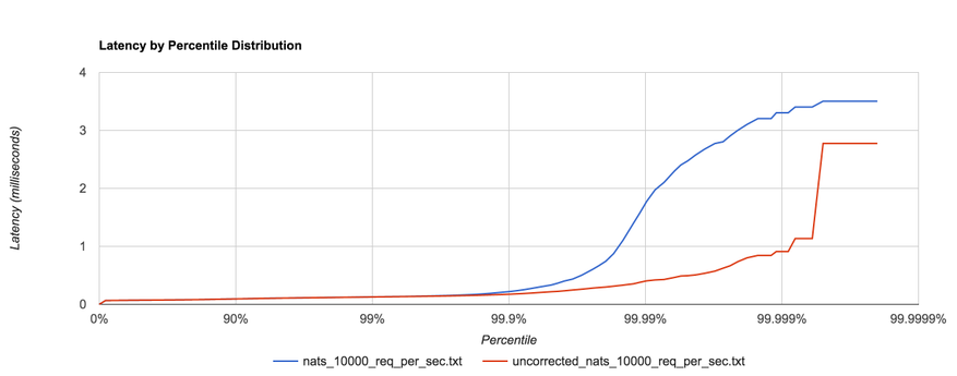
What’s the problem with this? Nothing, as long as our requests fit within the specified request schedule.  For example, if we’re issuing 100 requests per second and each request takes 10 ms to complete, we’re good. However, if one request takes 100 ms to complete, that means we issued only one request during those 100 ms when, according to our schedule, we should have issued 10 requests in that window. Nine other requests should have been issued, but the benchmark effectively coordinated with the system under test by backing off. In reality, those nine requests waited in line—one for 100 ms, one for 90 ms, one for 80 ms, etc. Most benchmarks don’t capture this time spent waiting in line, yet it can have a dramatic effect on the results. The graph below shows the same benchmark with coordinated omission both uncorrected (red) and corrected (blue):
coordinated_omission

HDR Histogram attempts to correct coordinated omission by filling in additional samples when a request falls outside of its expected interval. We can also deal with coordinated omission by simply avoiding it altogether—always issue requests according to the schedule.

Message Queue Benchmarks

I benchmarked several messaging systems using bench—RabbitMQ (3.6.0), Kafka (0.8.2.2 and 0.9.0.0), Redis (2.8.4) pub/sub, and NATS (0.7.3). In this context, a “request” consists of publishing a message to the server and waiting for a response (i.e. a roundtrip). We attempt to issue requests at a fixed rate and correct for coordinated omission, then plot the complete latency distribution all the way up to the 99.9999th percentile. We repeat this for several configurations of request rate and request size. It’s also important to note that each message going to and coming back from the server are of the specified size, i.e. the “response” is the same size as the “request.”

The configurations used are listed below. Each configuration is run for a sustained 30 seconds.

  • 256B requests at 3,000 requests/sec (768 KB/s)
  • 1KB requests at 3,000 requests/sec (3 MB/s)
  • 5KB requests at 2,000 requests/sec (10 MB/s)
  • 1KB requests at 20,000 requests/sec (20.48 MB/s)
  • 1MB requests at 100 requests/sec (100 MB/s)

These message sizes are mostly arbitrary, and there might be a better way to go about this. Though I think it’s worth pointing out that the Ethernet MTU is 1500 bytes, so accounting for headers, the maximum amount of data you’ll get in a single TCP packet will likely be between 1400 and 1500 bytes.

The system under test and benchmarking client are on two different m4.xlarge EC2 instances (2.4 GHz Intel Xeon Haswell, 16GB RAM) with enhanced networking enabled.

Redis and NATS

Redis pub/sub and NATS have similar performance characteristics. Both offer very lightweight, non-transactional messaging with no persistence options (discounting Redis’ RDB and AOF persistence, which don’t apply to pub/sub), and both support some level of topic pattern matching. I’m hesitant to call either a “message queue” in the traditional sense, so I usually just refer to them as message brokers or buses. Because of their ephemeral nature, both are a nice choice for low-latency, lossy messaging.

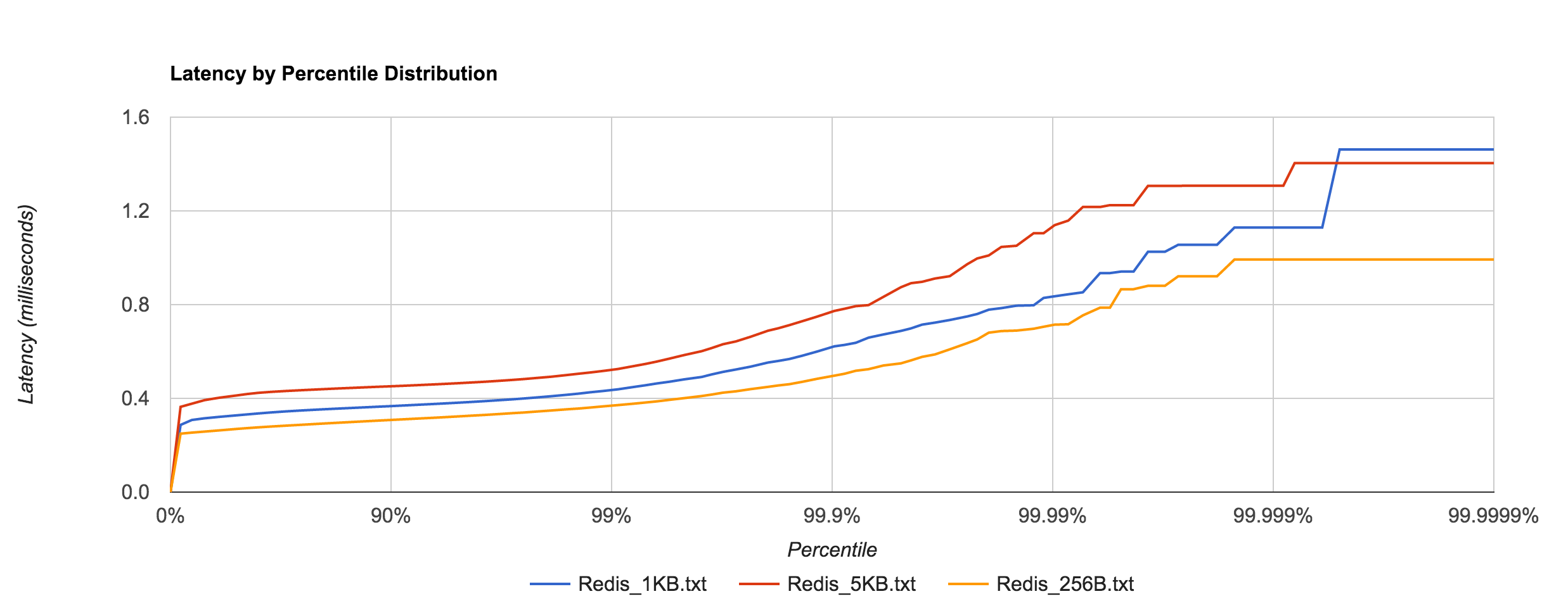
Redis tail latency peaks around 1.5 ms.

Redis_latency

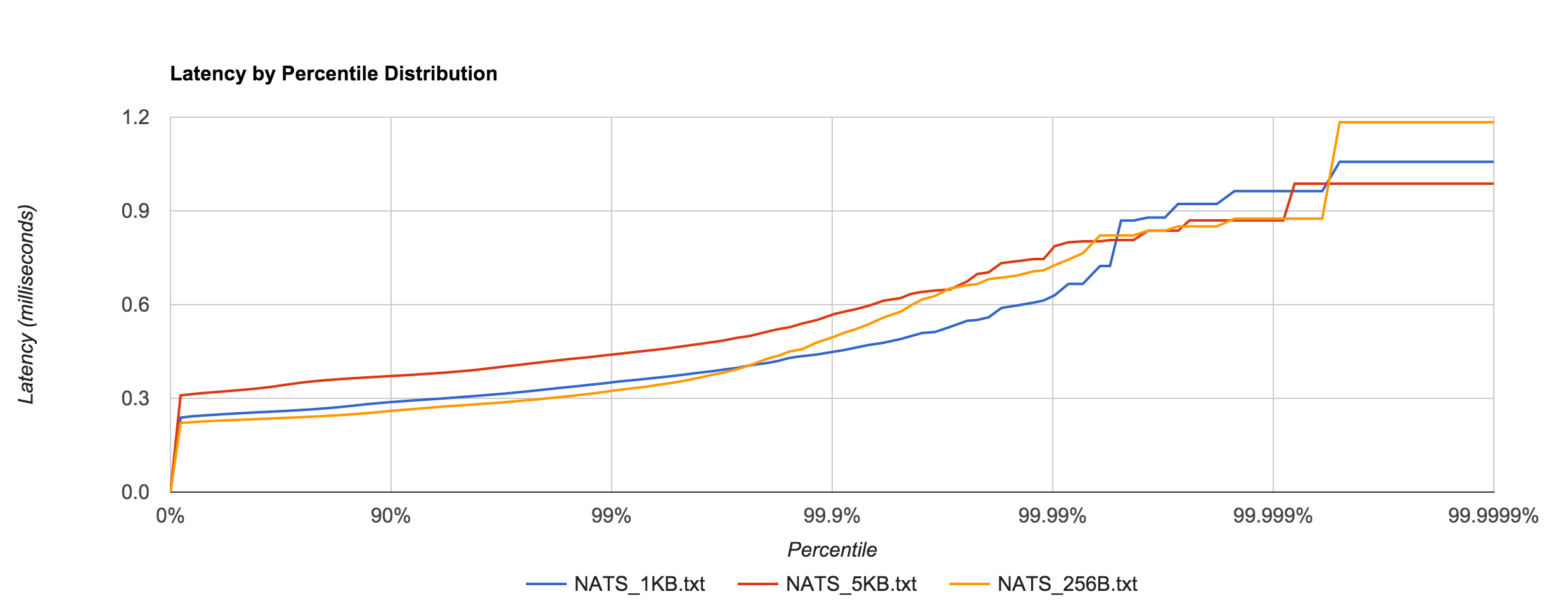
NATS performance looks comparable to Redis. Latency peaks around 1.2 ms.

NATS_latency

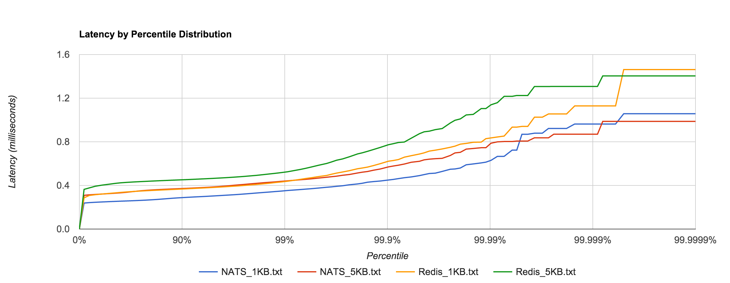
The resemblance becomes more apparent when we overlay the two distributions for the 1KB and 5KB runs. NATS tends to be about 0.1 to 0.4 ms faster.

Redis_NATS_latency

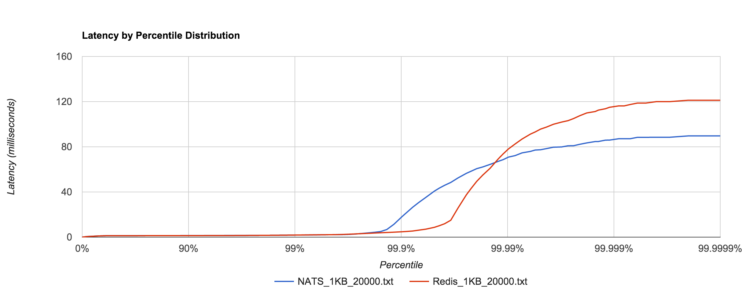
The 1KB, 20,000 requests/sec run uses 25 concurrent connections. With concurrent load, tail latencies jump up, peaking around 90 and 120 ms at the 99.9999th percentile in NATS and Redis, respectively.

Redis_NATS_1KB_20000_latency

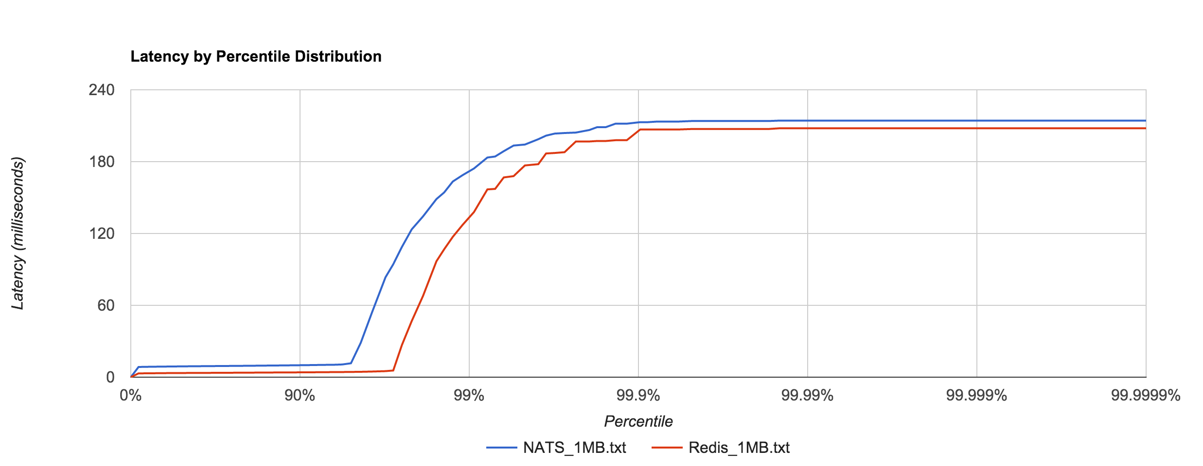
Large messages (1MB) don’t hold up nearly as well, exhibiting large tail latencies starting around the 95th and 97th percentiles in NATS and Redis, respectively. 1MB is the default maximum message size in NATS. The latency peaks around 214 ms. Again, keep in mind these are synchronous, roundtrip latencies.

Redis_NATS_1MB_latency

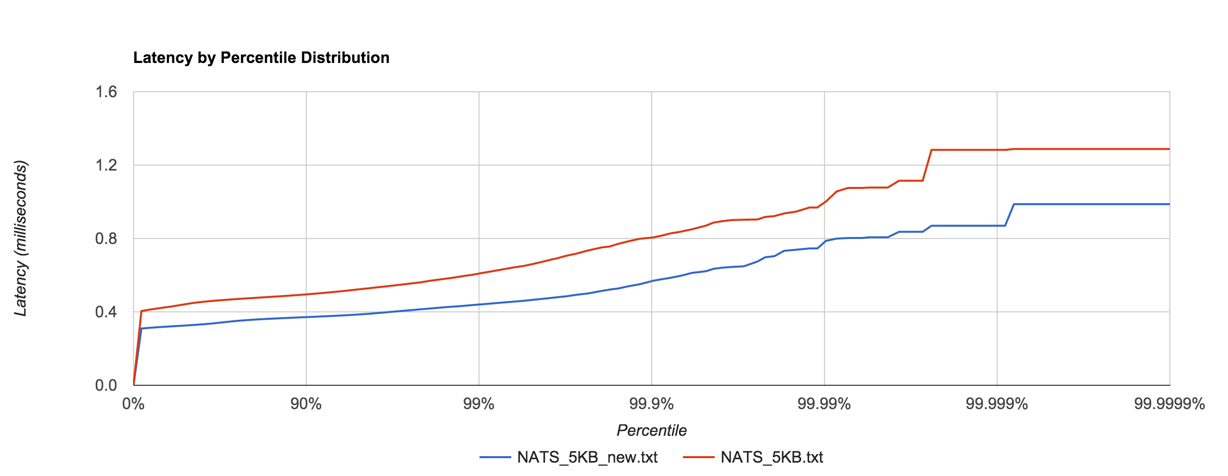
Apcera’s Ivan Kozlovic pointed out that the version of the NATS client I was using didn’t include a recent performance optimization. Before, the protocol parser scanned over each byte in the payload, but the newer version skips to the end (the previous benchmarks were updated to use the newer version). The optimization does have a noticeable effect, illustrated below. There was about a 30% improvement with the 5KB latencies.

NATS_optimization_latency

The difference is even more pronounced in the 1MB case, which has roughly a 90% improvement up to the 90th percentile. The linear scale in the graph below hides this fact, but at the 90th percentile, for example, the pre-optimization latency is 10 ms and the optimized latency is 3.8 ms. Clearly, the large tail is mostly unaffected, however.

NATS_1MB_optimization_latency

In general, this shows that NATS and Redis are better suited to smaller messages (well below 1MB), in which latency tends to be sub-millisecond up to four nines.

RabbitMQ and Kafka

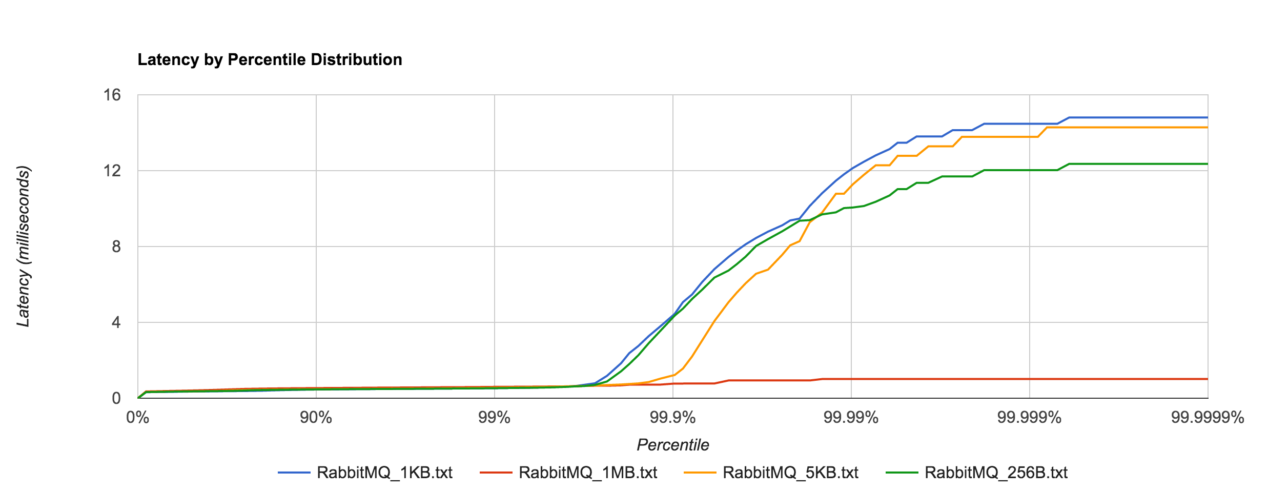
RabbitMQ is a popular AMQP implementation. Unlike NATS, it’s a more traditional message queue in the sense that it supports binding queues and transactional-delivery semantics. Consequently, RabbitMQ is a more “heavyweight” queuing solution and tends to pay an additional premium with latency. In this benchmark, non-durable queues were used. As a result, we should see reduced latencies since we aren’t going to disk.

RabbitMQ_latency

Latency tends to be sub-millisecond up to the 99.7th percentile, but we can see that it doesn’t hold up to NATS beyond that point for the 1KB and 5KB payloads.

RabbitMQ_NATS_latency

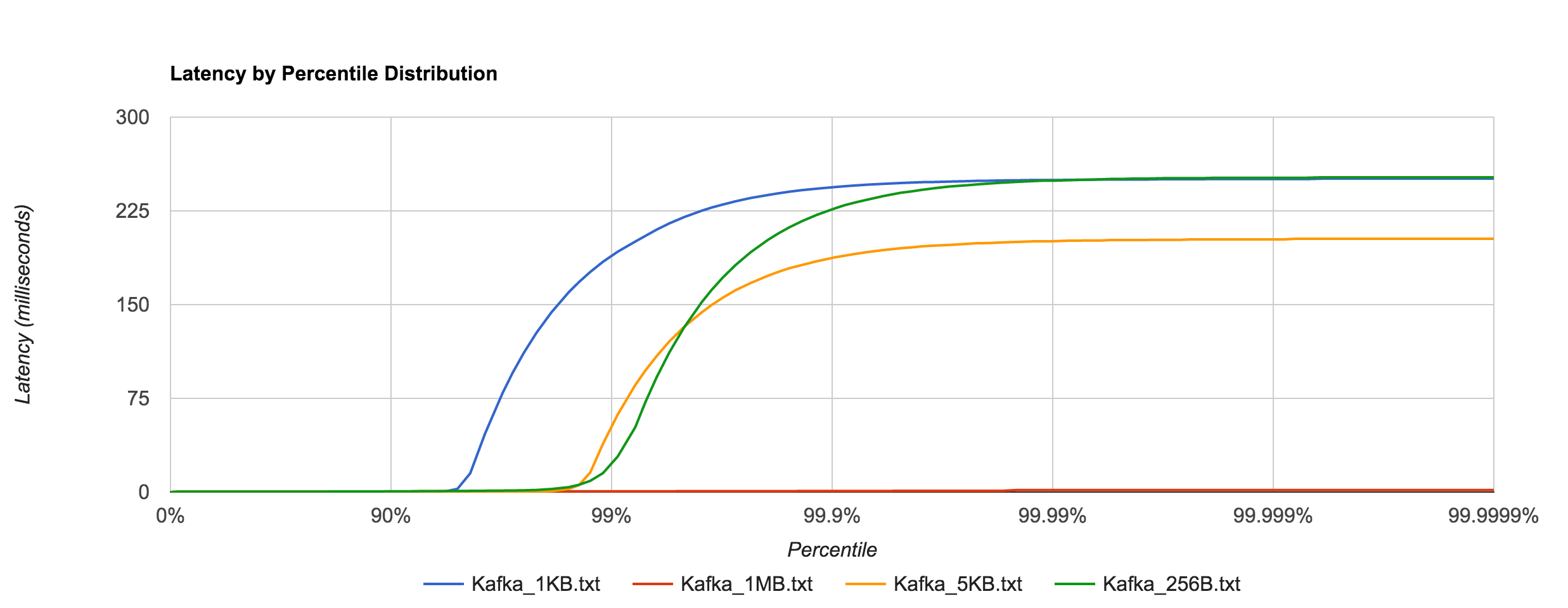
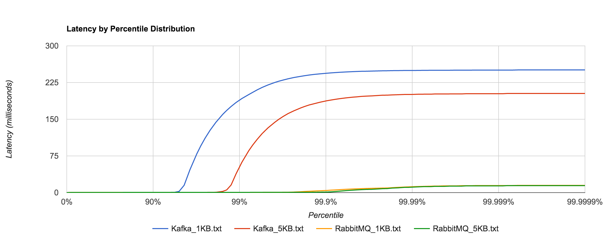
Kafka, on the other hand, requires disk persistence, but this doesn’t have a dramatic effect on latency until we look at the 94th percentile and beyond, when compared to RabbitMQ. Writes should be to page cache with flushes to disk happening asynchronously. The graphs below are for 0.8.2.2.

Kafka_latency

RabbitMQ_Kafka_latency

Once again, the 1KB, 20,000 requests/sec run is distributed across 25 concurrent connections. With RabbitMQ, we see the dramatic increase in tail latencies as we did with Redis and NATS. The RabbitMQ latencies in the concurrent case stay in line with the previous latencies up to about the 99th percentile. Interestingly, Kafka, doesn’t appear to be significantly affected. The latencies of 20,000 requests/sec at 1KB per request are not terribly different than the latencies of 3,000 requests/sec at 1KB per request, both peaking around 250 ms.

RabbitMQ_Kafka_1KB_20000_latency

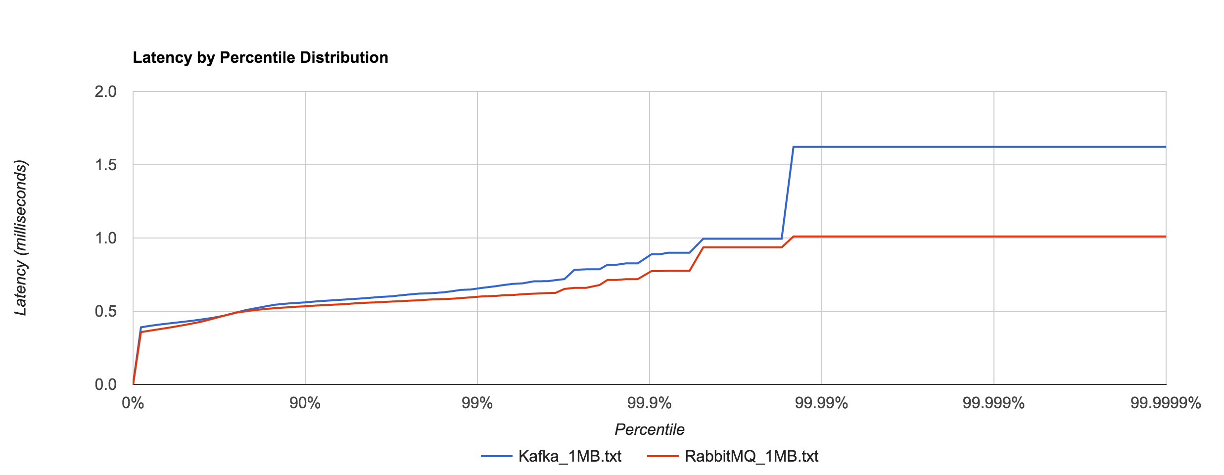
What’s particularly interesting is the behavior of 1MB messages vs. the rest. With RabbitMQ, there’s almost a 14x difference in max latencies between the 5KB and 1MB runs with 1MB being the faster. With Kafka 0.8.2.2, the difference is over 126x in the same direction. We can plot the 1MB latencies for RabbitMQ and Kafka since it’s difficult to discern them with a linear scale.

RabbitMQ_Kafka_1MB_latency

tried to understand what was causing this behavior. I’ve yet to find a reasonable explanation for RabbitMQ. Intuition tells me it’s a result of buffering—either at the OS level or elsewhere—and the large messages cause more frequent flushing. Remember that these benchmarks were with transient publishes. There should be no disk accesses occurring, though my knowledge of Rabbit’s internals are admittedly limited. The fact that this behavior occurs in RabbitMQ and not Redis or NATS seems odd. Nagle’s algorithm is disabled in all of the benchmarks (TCP_NODELAY). After inspecting packets with Wireshark, it doesn’t appear to be a problem with delayed acks.

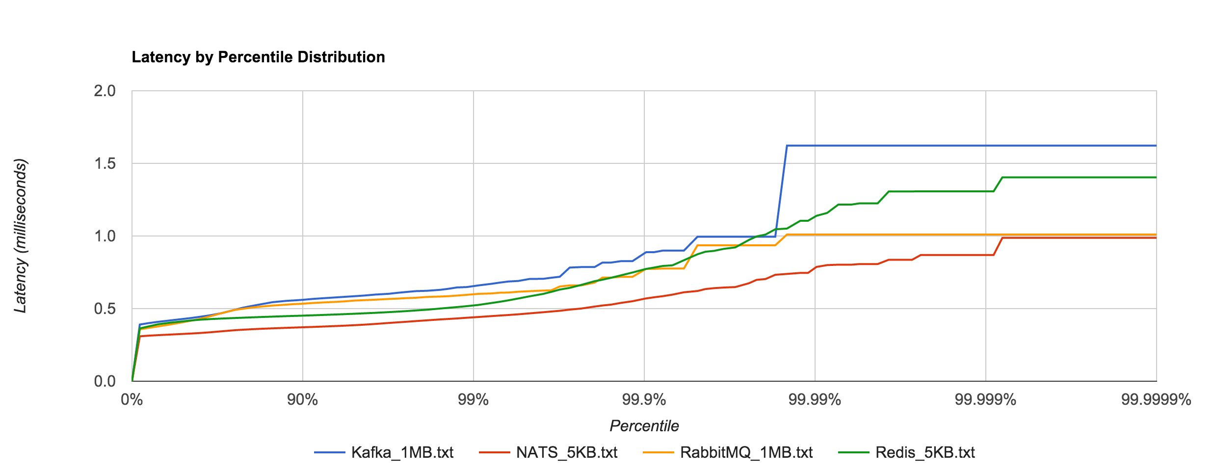
To show just how staggering the difference is, we can plot Kafka 0.8.2.2 and RabbitMQ 1MB latencies alongside Redis and NATS 5KB latencies. They are all within the same ballpark. Whatever the case may be, both RabbitMQ and Kafka appear to handle large messages extremely well in contrast to Redis and NATS.

RabbitMQ_Kafka_NATS_Redis_latency

This leads me to believe you’ll see better overall throughput, in terms of raw data, with RabbitMQ and Kafka, but more predictable, tighter tail latencies with Redis and NATS. Where SLAs are important, it’s hard to beat NATS. Of course, it’s unfair to compare Kafka with something like NATS or Redis or even RabbitMQ since they are very different (and sometimes complementary), but it’s also worth pointing out that the former is much more operationally complex.

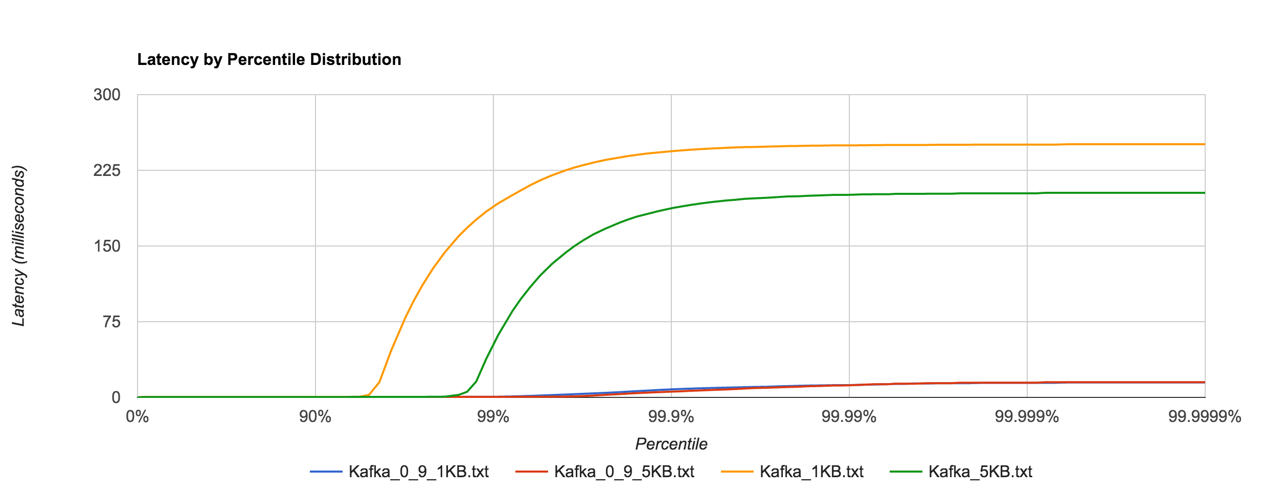
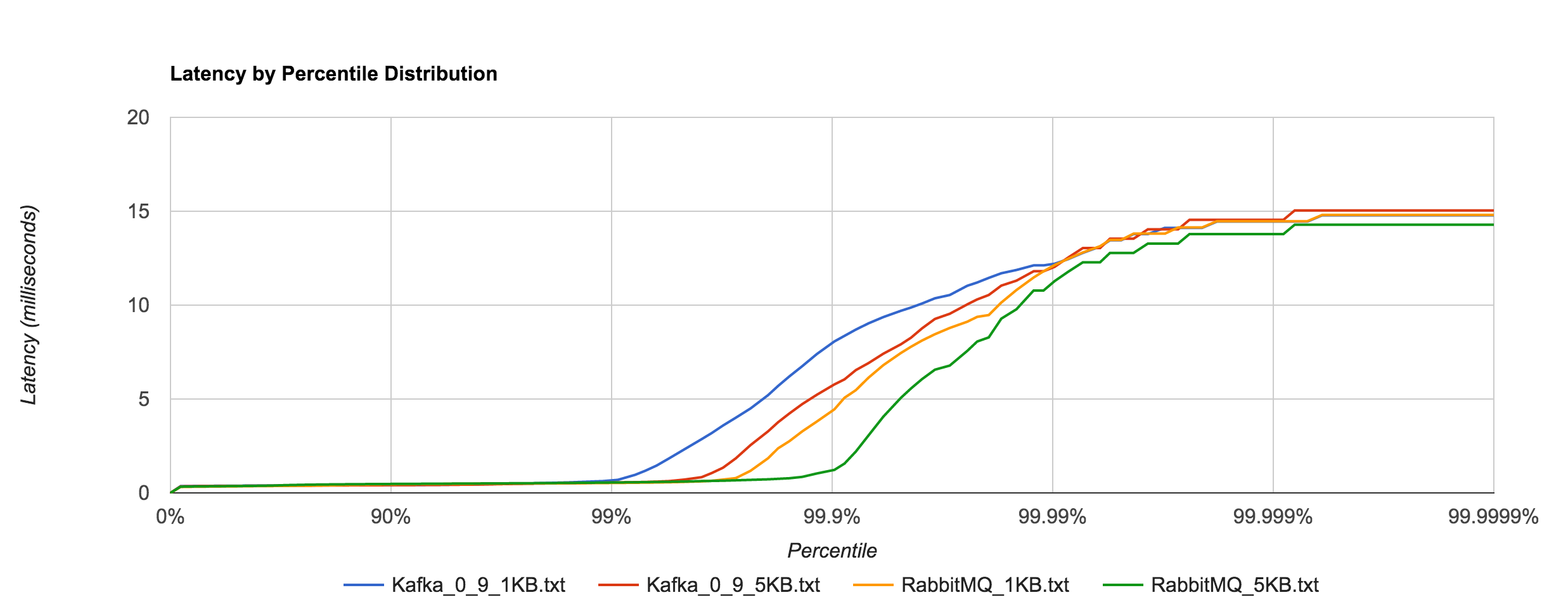
However, benchmarking Kafka 0.9.0.0 (blue and red) shows an astounding difference in tail latencies compared to 0.8.2.2 (orange and green).

Kafka_0_8_0_9_latency

Kafka 0.9’s performance is much more in line with RabbitMQ’s at high percentiles as seen below.

RabbitMQ_Kafka_0_9_latency

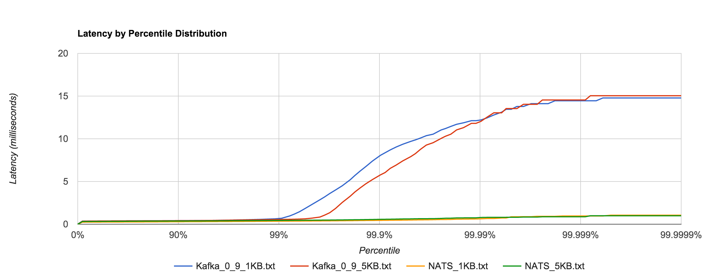
Likewise, it’s a much closer comparison to NATS when looking at the 1KB and 5KB runs.

Kafka_NATS_latency

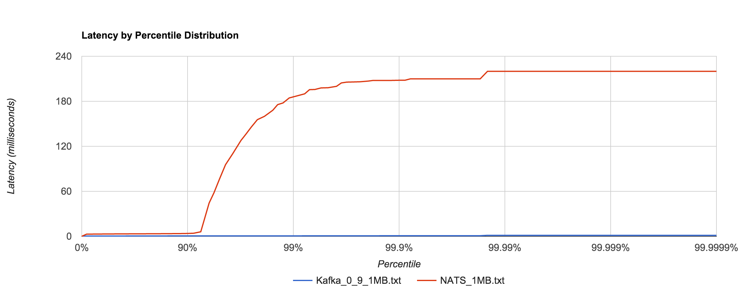
As with 0.8, Kafka 0.9 does an impressive job dealing with 1MB messages in comparison to NATS, especially when looking at the 92nd percentile and beyond. It’s hard to decipher in the graph below, but Kafka 0.9’s 99th, 99.9th, and 99.99th percentile latencies are 0.66, 0.78, and 1.35 ms, respectively.

Kafka_0_9_NATS_1MB

My initial thought was that the difference between Kafka 0.8 and 0.9 was attributed to a change in fsync behavior. To quote the Kafka documentation:

Kafka always immediately writes all data to the filesystem and supports the ability to configure the flush policy that controls when data is forced out of the OS cache and onto disk using the and flush. This flush policy can be controlled to force data to disk after a period of time or after a certain number of messages has been written.

However, there don’t appear to be any changes in the default flushing configuration between 0.8 and 0.9. The default configuration disables application fsync entirely, instead relying on the OS’s background flush. Jay Kreps indicates it’s a result of several “high percentile latency issues” that were fixed in 0.9. After scanning the 0.9 release notes, I was unable to determine specifically what those fixes might be. Either way, the difference is certainly not something to scoff at.

Conclusion

As always, interpret these benchmark results with a critical eye and perform your own tests if you’re evaluating these systems. This was more an exercise in benchmark methodology and tooling than an actual system analysis (and, as always, there’s still a lot of room for improvement). If anything, I think these results show how much we can miss by not looking beyond the 99th percentile. In almost all cases, everything looks pretty good up to that point, but after that things can get really bad. This is important to be conscious of when discussing SLAs.

I think the key takeaway is to consider your expected load in production, benchmark configurations around that, determine your allowable service levels, and iterate or provision more resources until you’re within those limits. The other important takeaway with respect to benchmarking is to look at the complete latency distribution. Otherwise, you’re not getting a clear picture of how your system actually behaves.

Everything You Know About Latency Is Wrong

Okay, maybe not everything you know about latency is wrong. But now that I have your attention, we can talk about why the tools and methodologies you use to measure and reason about latency are likely horribly flawed. In fact, they’re not just flawed, they’re probably lying to your face.

When I went to Strange Loop in September, I attended a workshop called “Understanding Latency and Application Responsiveness” by Gil Tene. Gil is the CTO of Azul Systems, which is most renowned for its C4 pauseless garbage collector and associated Zing Java runtime. While the workshop was four and a half hours long, Gil also gave a 40-minute talk called “How NOT to Measure Latency” which was basically an abbreviated, less interactive version of the workshop. If you ever get the opportunity to see Gil speak or attend his workshop, I recommend you do. At the very least, do yourself a favor and watch one of his recorded talks or find his slide decks online.

The remainder of this post is primarily a summarization of that talk. You may not get anything out of it that you wouldn’t get out of the talk, but I think it can be helpful to absorb some of these ideas in written form. Plus, for my own benefit, writing about them helps solidify it in my head.

What is Latency?

Latency is defined as the time it took one operation to happen. This means every operation has its own latency—with one million operations there are one million latencies. As a result, latency cannot be measured as work units / time. What we’re interested in is how latency behaves. To do this meaningfully, we must describe the complete distribution of latencies. Latency almost never follows a normal, Gaussian, or Poisson distribution, so looking at averages, medians, and even standard deviations is useless.

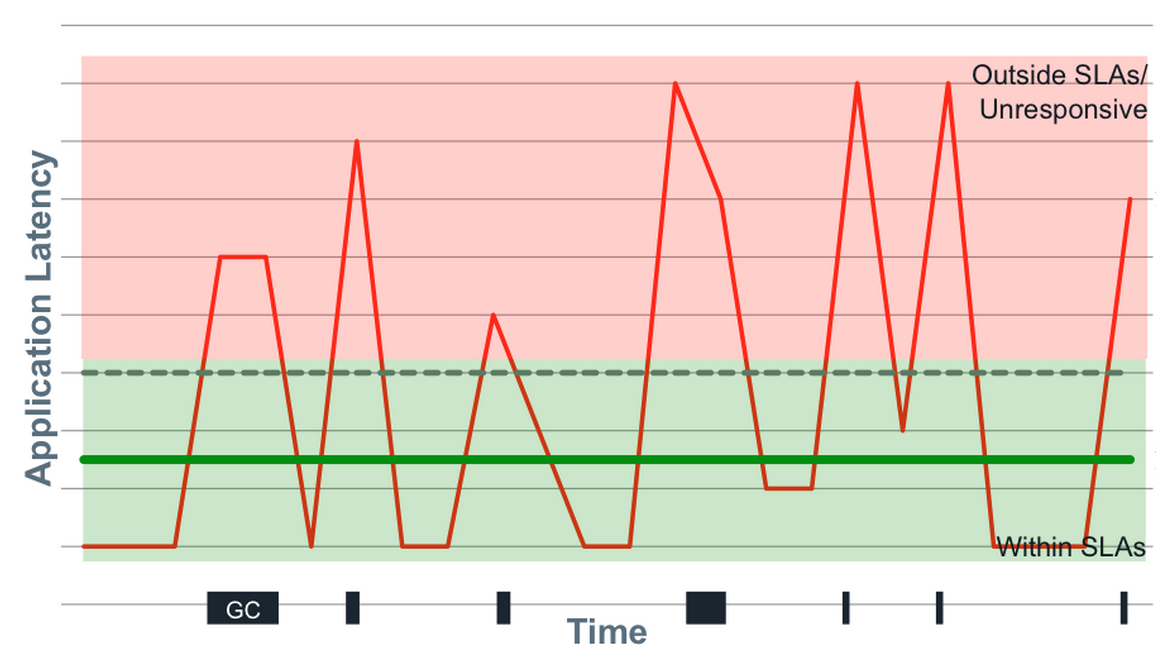
Latency tends to be heavily multi-modal, and part of this is attributed to “hiccups” in response time. Hiccups resemble periodic freezes and can be due to any number of reasons—GC pauses, hypervisor pauses, context switches, interrupts, database reindexing, cache buffer flushes to disk, etc. These hiccups never resemble normal distributions and the shift between modes is often rapid and eclectic.

Screen Shot 2015-10-04 at 4.32.24 PM

How do we meaningfully describe the distribution of latencies? We have to look at percentiles, but it’s even more nuanced than this. A trap that many people fall into is fixating on “the common case.” The problem with this is that there is a lot more to latency behavior than the common case. Not only that, but the “common” case is likely not as common as you think.

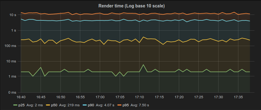
This is partly a tooling problem. Many of the tools we use do not do a good job of capturing and representing this data. For example, the majority of latency graphs produced by Grafana, such as the one below, are basically worthless. We like to look at pretty charts, and by plotting what’s convenient we get a nice colorful graph which is quite readable. Only looking at the 95th percentile is what you do when you want to hide all the bad stuff. As Gil describes, it’s a “marketing system.” Whether it’s the CTO, potential customers, or engineers—someone’s getting duped. Furthermore, averaging percentiles is mathematically absurd. To conserve space, we often keep the summaries and throw away the data, but the “average of the 95th percentile” is a meaningless statement. You cannot average percentiles, yet note the labels in most of your Grafana charts. Unfortunately, it only gets worse from here.

graph_logbase10_ms

Gil says, “The number one indicator you should never get rid of is the maximum value. That is not noise, that is the signal. The rest of it is noise.” To this point, someone in the workshop naturally responded with “But what if the max is just something like a VM restarting? That doesn’t describe the behavior of the system. It’s just an unfortunate, unlikely occurrence.” By ignoring the maximum, you’re effectively saying “this doesn’t happen.” If you can identify the cause as noise, you’re okay, but if you’re not capturing that data, you have no idea of what’s actually happening.

How Many Nines?

But how many “nines” do I really need to look at? The 99th percentile, by definition, is the latency below which 99% of the observations may be found. Is the 99th percentile rare? If we have a single search engine node, a single key-value store node, a single database node, or a single CDN node, what is the chance we actually hit the 99th percentile?

Gil describes some real-world data he collected which shows how many of the web pages we go to actually experience the 99th percentile, displayed in table below. The second column counts the number of HTTP requests generated by a single access of the web page. The third column shows the likelihood of one access experiencing the 99th percentile. With the exception of google.com, every page has a probability of 50% or higher of seeing the 99th percentile.

Screen Shot 2015-10-04 at 6.15.24 PM

The point Gil makes is that the 99th percentile is what most of your web pages will see. It’s not “rare.”

What metric is more representative of user experience? We know it’s not the average or the median. 95th percentile? 99.9th percentile? Gil walks through a simple, hypothetical example: a typical user session involves five page loads, averaging 40 resources per page. How many users will not experience something worse than the 95th percentile? 0.003%. By looking at the 95th percentile, you’re looking at a number which is relevant to 0.003% of your users. This means 99.997% of your users are going to see worse than this number, so why are you even looking at it?

On the flip side, 18% of your users are going to experience a response time worse than the 99.9th percentile, meaning 82% of users will experience the 99.9th percentile or better. Going further, more than 95% of users will experience the 99.97th percentile and more than 99% of users will experience the 99.995th percentile.

The median is the number that 99.9999999999% of response times will be worse than. This is why median latency is irrelevant. People often describe “typical” response time using a median, but the median just describes what everything will be worse than. It’s also the most commonly used metric.

If it’s so critical that we look at a lot of nines (and it is), why do most monitoring systems stop at the 95th or 99th percentile? The answer is simply because “it’s hard!” The data collected by most monitoring systems is usually summarized in small, five or ten second windows. This, combined with the fact that we can’t average percentiles or derive five nines from a bunch of small samples of percentiles means there’s no way to know what the 99.999th percentile for the minute or hour was. We end up throwing away a lot of good data and losing fidelity.

A Coordinated Conspiracy

Benchmarking is hard. Almost all latency benchmarks are broken because almost all benchmarking tools are broken. The number one cause of problems in benchmarks is something called “coordinated omission,” which Gil refers to as “a conspiracy we’re all a part of” because it’s everywhere. Almost all load generators have this problem.

We can look at a common load-testing example to see how this problem manifests. With this type of test, a client generally issues requests at a certain rate, measures the response time for each request, and puts them in buckets from which we can study percentiles later.

The problem is what if the thing being measured took longer than the time it would have taken before sending the next thing? What if you’re sending something every second, but this particular thing took 1.5 seconds? You wait before you send the next one, but by doing this, you avoided measuring something when the system was problematic. You’ve coordinated with it by backing off and not measuring when things were bad. To remain accurate, this method of measuring only works if all responses fit within an expected interval.

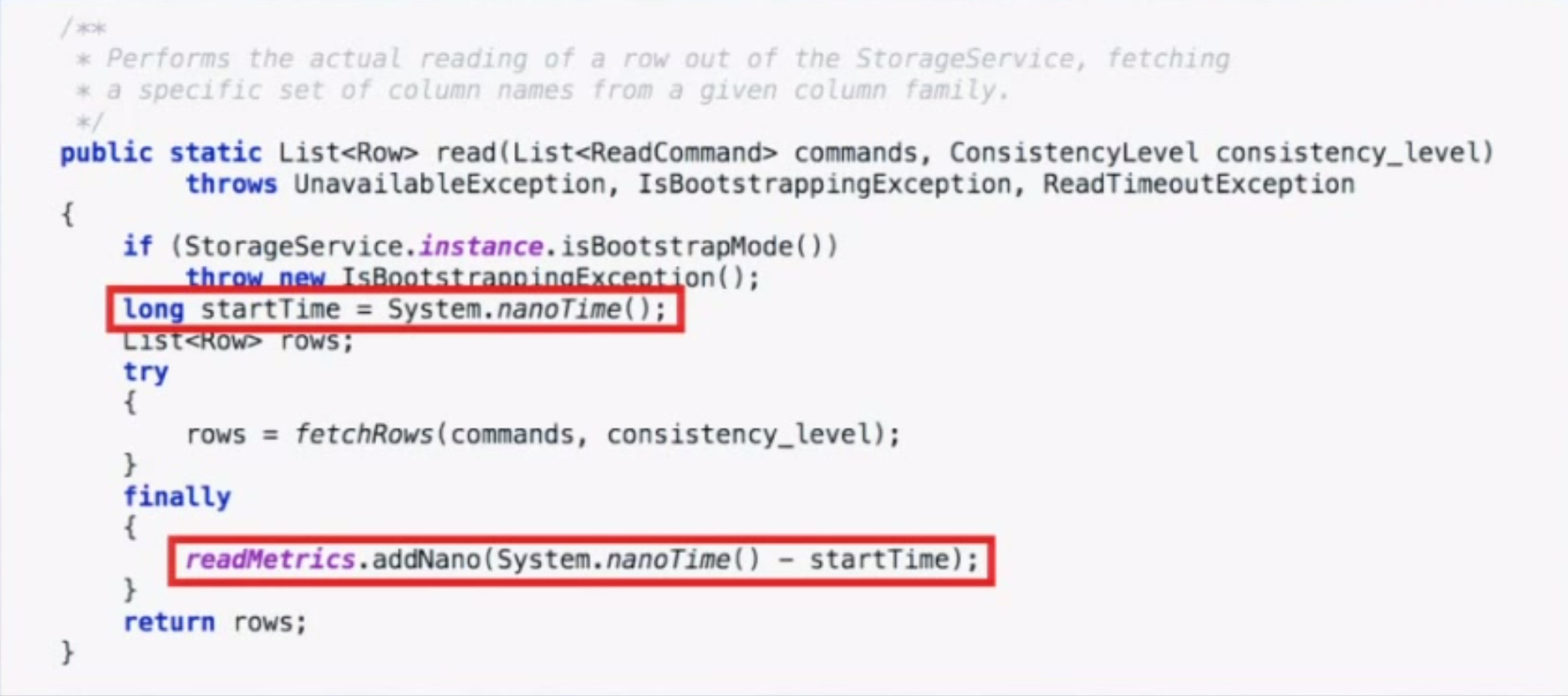
Coordinated omission also occurs in monitoring code. The way we typically measure something is by recording the time before, running the thing, then recording the time after and looking at the delta. We put the deltas in stats buckets and calculate percentiles from that. The code below is taken from a Cassandra benchmark.

Screen Shot 2015-10-04 at 7.29.09 PM

However, if the system experiences one of the “hiccups” described earlier, you will only have one bad operation and 10,000 other operations waiting in line. When those 10,000 other things go through, they will look really good when in reality the experience was really bad. Long operations only get measured once, and delays outside the timing window don’t get measured at all.

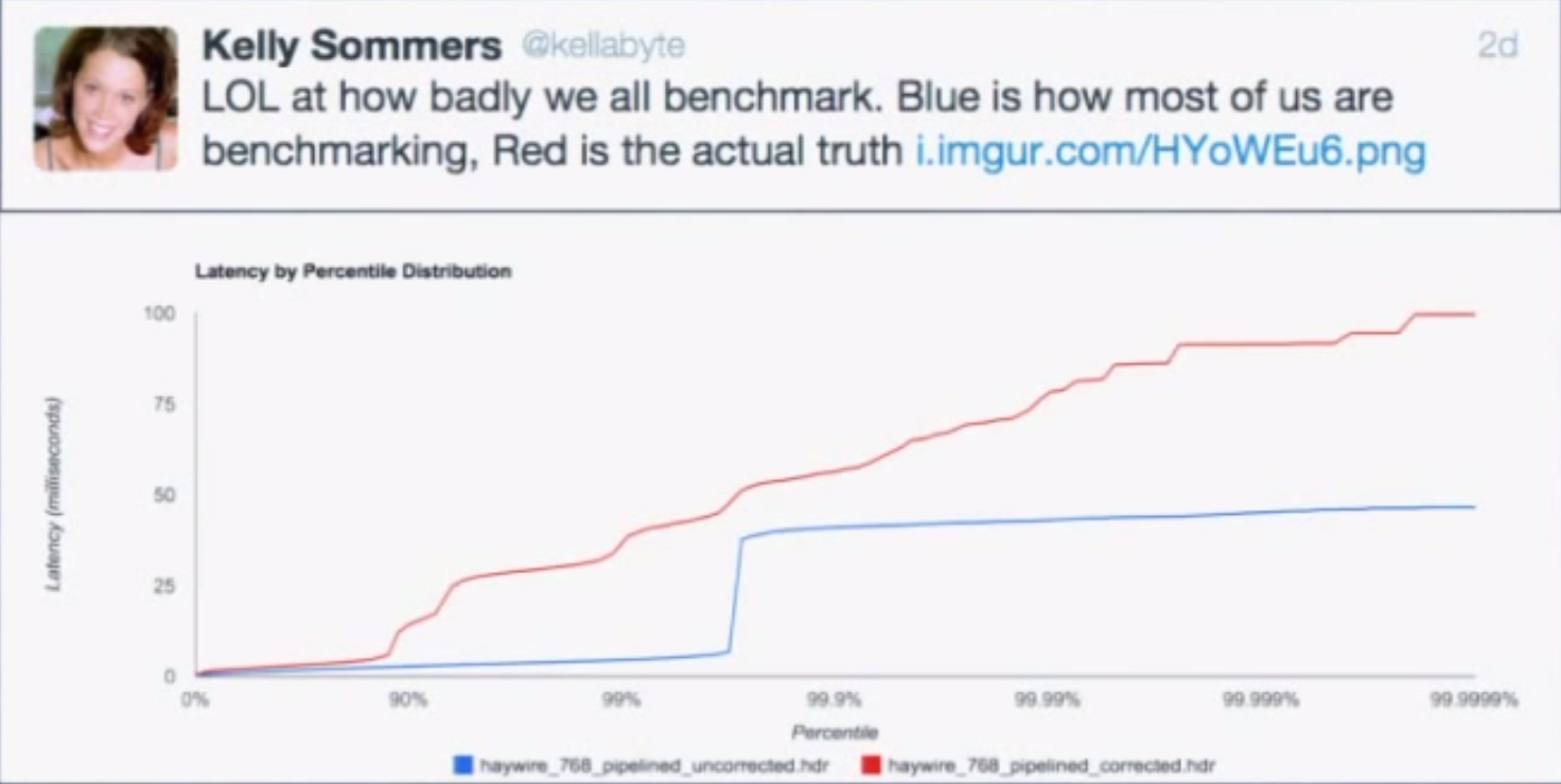
In both of these examples, we’re omitting data that looks bad on a very selective basis, but just how much of an impact can this have on benchmark results? It turns out the impact is huge.

Screen Shot 2015-10-04 at 7.27.43 PM

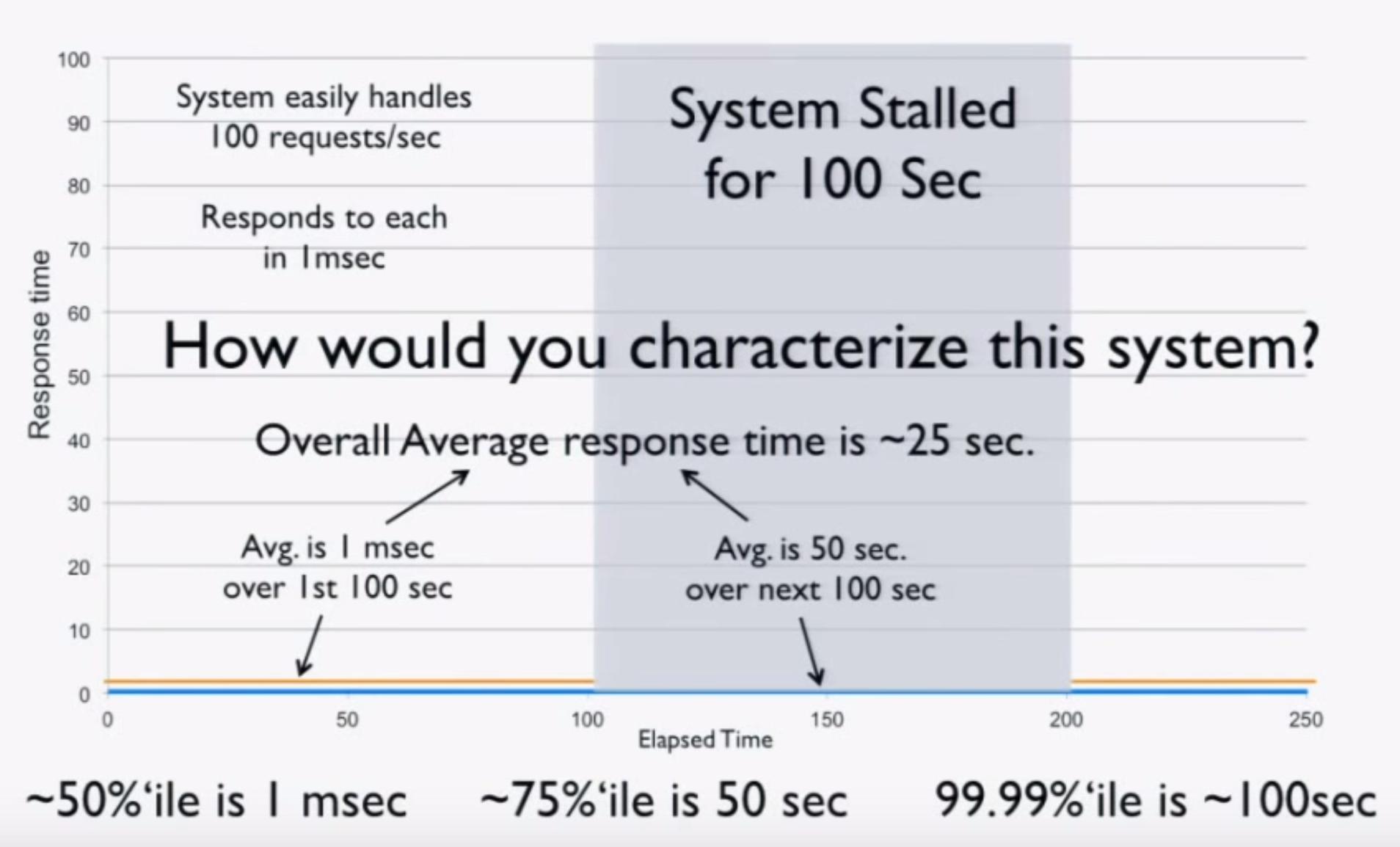
Imagine a “perfect” system which processes 100 requests/second at exactly 1 ms per request. Now consider what happens when we freeze the system (for example, using CTRL+Z) after 100 seconds of perfect operation for 100 seconds and repeat. We can intuitively characterize this system:

  • The average over the first 100 seconds is 1 ms.
  • The average over the next 100 seconds is 50 seconds.
  • The average over the 200 seconds is 25 seconds.
  • The 50th percentile is 1 ms.
  • The 75th percentile is 50 seconds.
  • The 99.99th percentile is 100 seconds.

Screen Shot 2015-10-04 at 7.49.10 PM

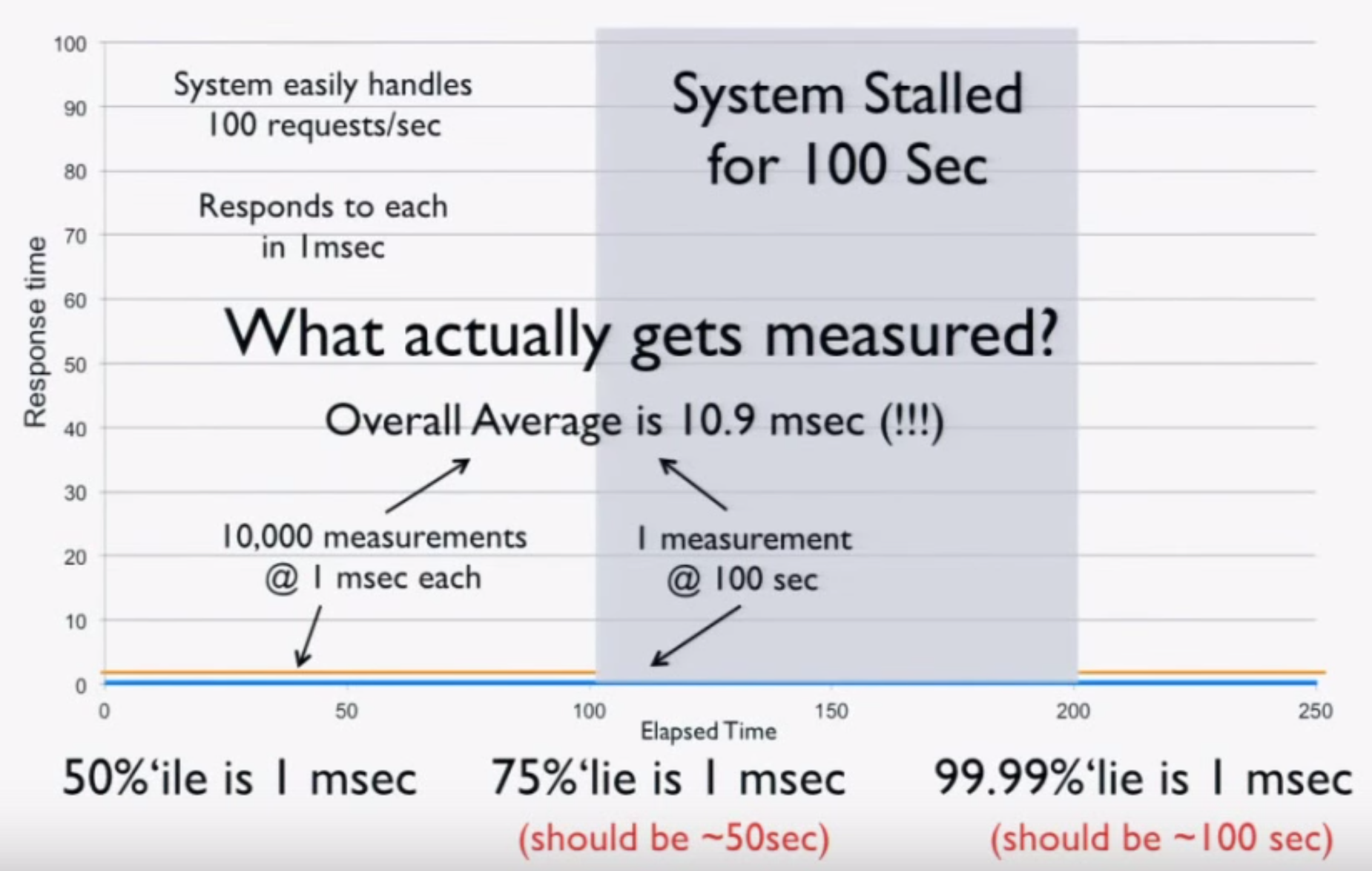
Now we try measuring the system using a load generator. Before freezing, we run 100 seconds at 100 requests/second for a total of 10,000 requests at 1 ms each. After the stall, we get one result of 100 seconds. This is the entirety of our data, and when we do the math, we get these results:

  • The average over the 200 seconds is 10.9 ms (should be 25 seconds).
  • The 50th percentile is 1 ms.
  • The 75th percentile is 1 ms (should be 50 seconds).
  • The 99.99th percentile is 1 ms (should be 100 seconds).

Screen Shot 2015-10-04 at 7.57.23 PM

Basically, your load generator and monitoring code tell you the system is ready for production, when in fact it’s lying to you! A simple “CTRL+Z” test can catch coordinated omission, but people rarely do it. It’s critical to calibrate your system this way. If you find it giving you these kind of results, throw away all the numbers—they’re worthless.

You have to measure at random or “fair” rates. If you measure 10,000 things in the first 100 seconds, you have to measure 10,000 things in the second 100 seconds during the stall. If you do this, you’ll get the correct numbers, but they won’t be as pretty. Coordinated omission is the simple act of erasing, ignoring, or missing all the “bad” stuff, but the data is good.

Surely this data can still be useful though, even if it doesn’t accurately represent the system? For example, we can still use it to identify performance regressions or validate improvements, right? Sadly, this couldn’t be further from the truth. To see why, imagine we improve our system. Instead of pausing for 100 seconds after 100 seconds of perfect operation, it handles all requests at 5 ms each after 100 seconds. Doing the math, we get the following:

  • The 50th percentile is 1 ms
  • The 75th percentile is 2.5 ms (stall showed 1 ms)
  • The 99.99th percentile is 5 ms (stall showed 1 ms)

This data tells us we hurt the four nines and made the system 5x worse! This would tell us to revert the change and go back to the way it was before, which is clearly the wrong decision. With bad data, better can look worse. This shows that you cannot have any intuition based on any of these numbers. The data is garbage.

With many load generators, the situation is actually much worse than this. These systems work by generating a constant load. If our test is generating 100 requests/second, we run 10,000 requests in the first 100 seconds. When we stall, we process just one request. After the stall, the load generator sees that it’s 9,999 requests behind and issues those requests to catch back up. Not only did it get rid of the bad requests, it replaced them with good requests. Now the data is twice as wrong as just dropping the bad requests.

What coordinated omission is really showing you is service time, not response time. If we imagine a cashier ringing up customers, the service time is the time it takes the cashier to do the work. The response time is the time a customer waits before they reach the register. If the rate of arrival is higher than the service rate, the response time will continue to grow. Because hiccups and other phenomena happen, response times often bounce around. However, coordinated omission lies to you about response time by actually telling you the service time and hiding the fact that things stalled or waited in line.

Measuring Latency

Latency doesn’t live in a vacuum. Measuring response time is important, but you need to look at it in the context of load. But how do we properly measure this? When you’re nearly idle, things are nearly perfect, so obviously that’s not very useful. When you’re pedal to the metal, things fall apart. This is somewhat useful because it tells us how “fast” we can go before we start getting angry phone calls.

However, studying the behavior of latency at saturation is like looking at the shape of your car’s bumper after wrapping it around a pole. The only thing that matters when you hit the pole is that you hit the pole. There’s no point in trying to engineer a better bumper, but we can engineer for the speed at which we lose control. Everything is going to suck at saturation, so it’s not super useful to look at beyond determining your operating range.

What’s more important is testing the speeds in between idle and hitting the pole. Define your SLAs and plot those requirements, then run different scenarios using different loads and different configurations. This tells us if we’re meeting our SLAs but also how many machines we need to provision to do so. If you don’t do this, you don’t know how many machines you need.

How do we capture this data? In an ideal world, we could store information for every request, but this usually isn’t practical. HdrHistogram is a tool which allows you to capture latency and retain high resolution. It also includes facilities for correcting coordinated omission and plotting latency distributions. The original version of HdrHistogram was written in Java, but there are versions for many other languages.

Screen Shot 2015-10-05 at 12.00.04 AM

To Summarize

To understand latency, you have to consider the entire distribution. Do this by plotting the latency distribution curve. Simply looking at the 95th or even 99th percentile is not sufficient. Tail latency matters. Worse yet, the median is not representative of the “common” case, the average even less so. There is no single metric which defines the behavior of latency. Be conscious of your monitoring and benchmarking tools and the data they report. You can’t average percentiles.

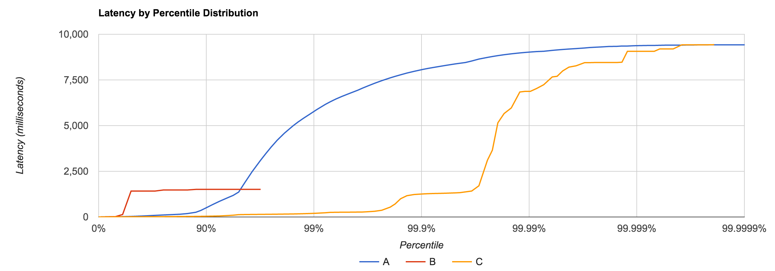
Remember that latency is not service time. If you plot your data with coordinated omission, there’s often a quick, high rise in the curve. Run a “CTRL+Z” test to see if you have this problem. A non-omitted test has a much smoother curve. Very few tools actually correct for coordinated omission.

Latency needs to be measured in the context of load, but constantly running your car into a pole in every test is not useful. This isn’t how you’re running in production, and if it is, you probably need to provision more machines. Use it to establish your limits and test the sustainable throughputs in between to determine if you’re meeting your SLAs. There are a lot of flawed tools out there, but HdrHistogram is one of the few that isn’t. It’s useful for benchmarking and, since histograms are additive and HdrHistogram uses log buckets, it can also be useful for capturing high-volume data in production.

Benchmark Responsibly

When I posted my Dissecting Message Queues article last summer, it understandably caused some controversy.  I received both praise and scathing comments, emails asking why I didn’t benchmark X and pull requests to bump the numbers of Y. To be honest, that analysis was more of a brain dump from my own test driving of various message queues than any sort of authoritative or scientific study—it was far from the latter, to say the least. The qualitative discussion was pretty innocuous, but the benchmarks and supporting code were the target of a lot of (valid) criticism. In retrospect, it was probably irresponsible to publish them, but I was young and naive back then; now I’m just mostly naive.

Comparing Apples to Other Assorted Fruit

One such criticism was that the benchmarks were divided into two very broad categories: brokerless and brokered. While the brokerless group compared two very similar libraries, ZeroMQ and nanomsg, the second group included a number of distinct message brokers like RabbitMQ, Kafka, NATS, and Redis, to name a few.

The problem is not all brokers are created equal. They often have different goals and different prescribed use cases. As such, they impose different guarantees, different trade-offs, and different constraints. By grouping these benchmarks together, I implied they were fundamentally equivalent, when in fact, most were fundamentally different. For example, NATS serves a very different purpose than Kafka, and Redis, which offers pub/sub messaging, typically isn’t thought of as a message broker at all.

Measure Right or Don’t Measure at All

Another criticism was the way in which the benchmarks were performed. The tests were immaterial. The producer, consumer, and the message queue itself all ran on the same machine. Even worse, they used just a single publisher and subscriber. Not only does it not test what a remotely realistic configuration looks like, but it doesn’t even give you a good idea of a trivial one.

To be meaningful, we need to test with more than one producer and consumer, ideally distributed across many machines. We want to see how the system scales to larger workloads. Certainly, the producers and consumers cannot be collocated when we’re measuring discrete throughputs on either end, nor should the broker. This helps to reduce confounding variables between the system under test and the load generation.

It’s Not Rocket Science, It’s Computer Science

The third major criticism lay with the measurements themselves. Measuring throughput is fairly straightforward: we look at the number of messages sent per unit of time at both the sender and the receiver. If we think of a pipe carrying water, we might look at a discrete cross section and the rate at which water passes through it.

Latency, as a concept, is equally simple. With the pipe, it’s the time it takes for a drop of water to travel from one end to the other. While throughput is dependent on the pipe’s diameter, latency is dependent upon its length. What this means is that we can’t derive one from the other. In order to properly measure latency, we need to consider the latency of each message sent through the system.

However, we can’t ignore the relationship between throughput and latency and what the compromise between them means. Generally, we want to make things as fast as possible. Consider a single-cycle CPU. Its latency per instruction will be extremely low but contrasted with a pipelined processor, its throughput is abysmal—one instruction per clock cycle. The implication is that if we trade per-operation latency for throughput, we actually get a decrease in latency for aggregate instructions. Unfortunately, the benchmarks eschewed this relationship by requiring separate latency and throughput tests which used different code paths.

The interaction between latency and throughput is easy to get confused, but it often has interesting ramifications, whether you’re looking at message queues, CPUs, or databases. In a general sense, we’d say “optimize for latency” because lower latency means higher throughput, but the reality is it’s almost always easier (and more cost-effective) to increase throughput than it is to decrease latency, especially on commodity hardware.

Capturing this data, in and of itself, isn’t terribly difficult, but what’s more susceptible to error is how it’s represented. This was the main fault of the benchmarks (in addition to the things described earlier). The most egregious thing they did was report latency as an average. This is like the cardinal sin of benchmarking. The number is practically useless, particularly without any context like a standard deviation.

We know that latency isn’t going to be uniform, but it’s probably not going to follow a normal distribution either. While network latency may be prone to fitting a nice bell curve, system latency almost certainly won’t. They often exhibit things like GC pauses and other “hiccups,” and averages tend to hide these.

latency

Measuring performance isn’t all that easy, but if you do it, at least do it in a way that disambiguates the results. Look at quantiles, not averages. If you do present a mean, include the standard deviation and max in addition to the 90th or 99th percentile. Plotting latency by percentile distribution is an excellent way to see what your performance behavior actually looks like. Gil Tene has a great talk on measuring latency which I highly recommend.

Working Towards a Better Solution

With all this in mind, we can work towards building a better way to test and measure messaging systems. The discussion above really just gives us three key takeaways:

  1. Don’t compare apples to oranges.
  2. Don’t instrument tests in a way that’s not at all representative of real life.
  3. Don’t present results in a statistically insignificant way.

My first attempt at taking these ideas to heart is a tool I call Flotilla. It’s meant to provide a way to test messaging systems in more realistic configurations, at scale, while offering more useful data. Flotilla allows you to easily spin up producers and consumers on arbitrarily many machines, start a message broker, and run a benchmark against it, all in an automated fashion. It then collects data like producer/consumer throughput and the complete latency distribution and reports back to the user.

Flotilla uses a Go port of HdrHistogram to capture latency data, of which I’m a raving fan. HdrHistogram uses a bucketed approach to record values across a configured high-dynamic range at a particular resolution. Recording is in the single-nanosecond range and the memory footprint is constant. It also has support for correcting coordinated omission, which is a common problem in benchmarking. Seriously, if you’re doing anything performance sensitive, give HdrHistogram a look.

Still, Flotilla is not perfect and there’s certainly work to do, but I think it’s a substantial improvement over the previous MQ benchmarking utility. Longer term, it would be great to integrate it with something like Comcast to test workloads under different network conditions. Testing in a vacuum is nice and all, but we know in the real word, the network isn’t perfectly reliable.

So, Where Are the Benchmarks?

Omitted—for now, anyway. My goal really isn’t to rank a hodgepodge of different message queues because there’s really not much value in doing that. There are different use cases for different systems. I might, at some point, look at individual systems in greater detail, but comparing things like message throughput and latency just devolves into a hotly contested pissing contest. My hope is to garner more feedback and improvements to Flotilla before using it to definitively measure anything.

Benchmark responsibly.