Okay, maybe not everything you know about latency is wrong. But now that I have your attention, we can talk about why the tools and methodologies you use to measure and reason about latency are likely horribly flawed. In fact, they’re not just flawed, they’re probably lying to your face.
When I went to Strange Loop in September, I attended a workshop called “Understanding Latency and Application Responsiveness” by Gil Tene. Gil is the CTO of Azul Systems, which is most renowned for its C4 pauseless garbage collector and associated Zing Java runtime. While the workshop was four and a half hours long, Gil also gave a 40-minute talk called “How NOT to Measure Latency” which was basically an abbreviated, less interactive version of the workshop. If you ever get the opportunity to see Gil speak or attend his workshop, I recommend you do. At the very least, do yourself a favor and watch one of his recorded talks or find his slide decks online.
The remainder of this post is primarily a summarization of that talk. You may not get anything out of it that you wouldn’t get out of the talk, but I think it can be helpful to absorb some of these ideas in written form. Plus, for my own benefit, writing about them helps solidify it in my head.
What is Latency?
Latency is defined as the time it took one operation to happen. This means every operation has its own latency—with one million operations there are one million latencies. As a result, latency cannot be measured as work units / time. What we’re interested in is how latency behaves. To do this meaningfully, we must describe the complete distribution of latencies. Latency almost never follows a normal, Gaussian, or Poisson distribution, so looking at averages, medians, and even standard deviations is useless.
Latency tends to be heavily multi-modal, and part of this is attributed to “hiccups” in response time. Hiccups resemble periodic freezes and can be due to any number of reasons—GC pauses, hypervisor pauses, context switches, interrupts, database reindexing, cache buffer flushes to disk, etc. These hiccups never resemble normal distributions and the shift between modes is often rapid and eclectic.
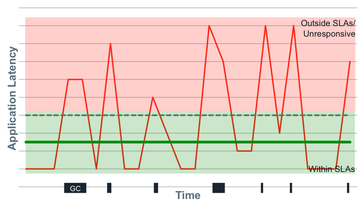
How do we meaningfully describe the distribution of latencies? We have to look at percentiles, but it’s even more nuanced than this. A trap that many people fall into is fixating on “the common case.” The problem with this is that there is a lot more to latency behavior than the common case. Not only that, but the “common” case is likely not as common as you think.
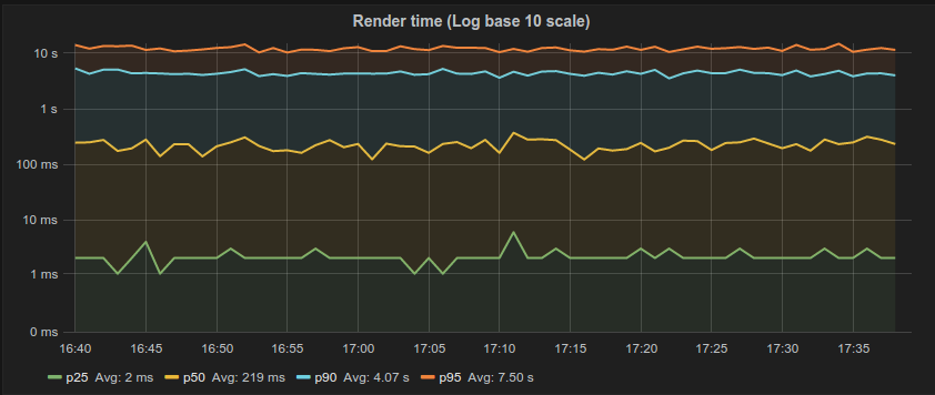
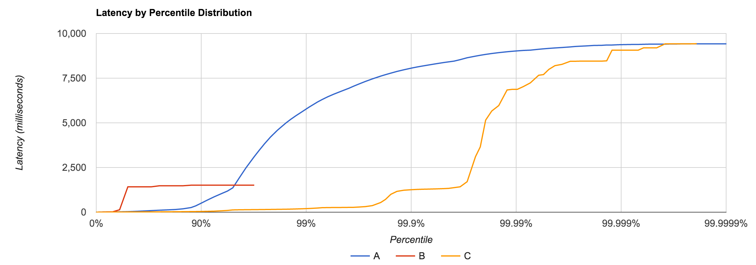
This is partly a tooling problem. Many of the tools we use do not do a good job of capturing and representing this data. For example, the majority of latency graphs produced by Grafana, such as the one below, are basically worthless. We like to look at pretty charts, and by plotting what’s convenient we get a nice colorful graph which is quite readable. Only looking at the 95th percentile is what you do when you want to hide all the bad stuff. As Gil describes, it’s a “marketing system.” Whether it’s the CTO, potential customers, or engineers—someone’s getting duped. Furthermore, averaging percentiles is mathematically absurd. To conserve space, we often keep the summaries and throw away the data, but the “average of the 95th percentile” is a meaningless statement. You cannot average percentiles, yet note the labels in most of your Grafana charts. Unfortunately, it only gets worse from here.
Gil says, “The number one indicator you should never get rid of is the maximum value. That is not noise, that is the signal. The rest of it is noise.” To this point, someone in the workshop naturally responded with “But what if the max is just something like a VM restarting? That doesn’t describe the behavior of the system. It’s just an unfortunate, unlikely occurrence.” By ignoring the maximum, you’re effectively saying “this doesn’t happen.” If you can identify the cause as noise, you’re okay, but if you’re not capturing that data, you have no idea of what’s actually happening.
How Many Nines?
But how many “nines” do I really need to look at? The 99th percentile, by definition, is the latency below which 99% of the observations may be found. Is the 99th percentile rare? If we have a single search engine node, a single key-value store node, a single database node, or a single CDN node, what is the chance we actually hit the 99th percentile?
Gil describes some real-world data he collected which shows how many of the web pages we go to actually experience the 99th percentile, displayed in table below. The second column counts the number of HTTP requests generated by a single access of the web page. The third column shows the likelihood of one access experiencing the 99th percentile. With the exception of google.com, every page has a probability of 50% or higher of seeing the 99th percentile.
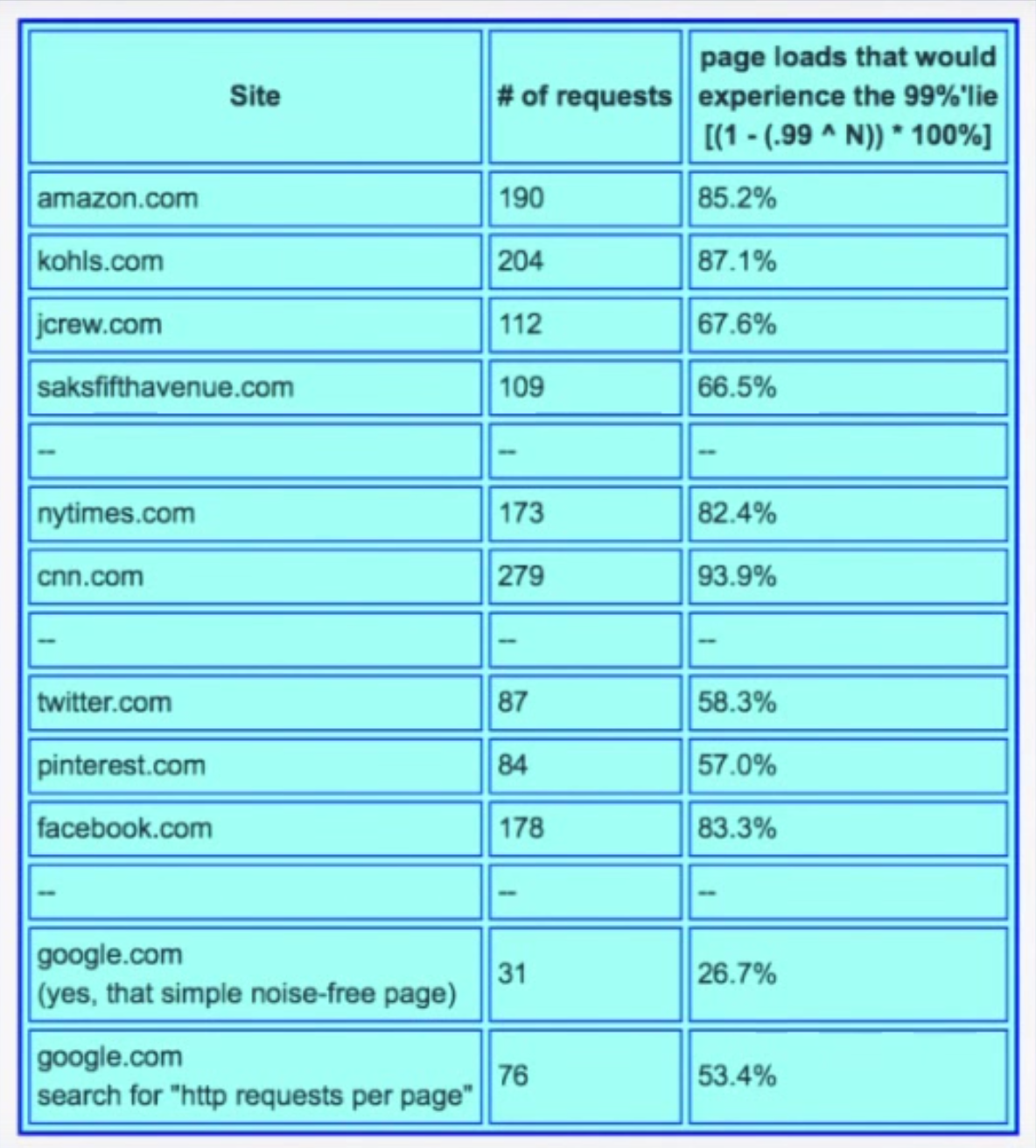
The point Gil makes is that the 99th percentile is what most of your web pages will see. It’s not “rare.”
What metric is more representative of user experience? We know it’s not the average or the median. 95th percentile? 99.9th percentile? Gil walks through a simple, hypothetical example: a typical user session involves five page loads, averaging 40 resources per page. How many users will not experience something worse than the 95th percentile? 0.003%. By looking at the 95th percentile, you’re looking at a number which is relevant to 0.003% of your users. This means 99.997% of your users are going to see worse than this number, so why are you even looking at it?
On the flip side, 18% of your users are going to experience a response time worse than the 99.9th percentile, meaning 82% of users will experience the 99.9th percentile or better. Going further, more than 95% of users will experience the 99.97th percentile and more than 99% of users will experience the 99.995th percentile.
The median is the number that 99.9999999999% of response times will be worse than. This is why median latency is irrelevant. People often describe “typical” response time using a median, but the median just describes what everything will be worse than. It’s also the most commonly used metric.
If it’s so critical that we look at a lot of nines (and it is), why do most monitoring systems stop at the 95th or 99th percentile? The answer is simply because “it’s hard!” The data collected by most monitoring systems is usually summarized in small, five or ten second windows. This, combined with the fact that we can’t average percentiles or derive five nines from a bunch of small samples of percentiles means there’s no way to know what the 99.999th percentile for the minute or hour was. We end up throwing away a lot of good data and losing fidelity.
A Coordinated Conspiracy
Benchmarking is hard. Almost all latency benchmarks are broken because almost all benchmarking tools are broken. The number one cause of problems in benchmarks is something called “coordinated omission,” which Gil refers to as “a conspiracy we’re all a part of” because it’s everywhere. Almost all load generators have this problem.
We can look at a common load-testing example to see how this problem manifests. With this type of test, a client generally issues requests at a certain rate, measures the response time for each request, and puts them in buckets from which we can study percentiles later.
The problem is what if the thing being measured took longer than the time it would have taken before sending the next thing? What if you’re sending something every second, but this particular thing took 1.5 seconds? You wait before you send the next one, but by doing this, you avoided measuring something when the system was problematic. You’ve coordinated with it by backing off and not measuring when things were bad. To remain accurate, this method of measuring only works if all responses fit within an expected interval.
Coordinated omission also occurs in monitoring code. The way we typically measure something is by recording the time before, running the thing, then recording the time after and looking at the delta. We put the deltas in stats buckets and calculate percentiles from that. The code below is taken from a Cassandra benchmark.
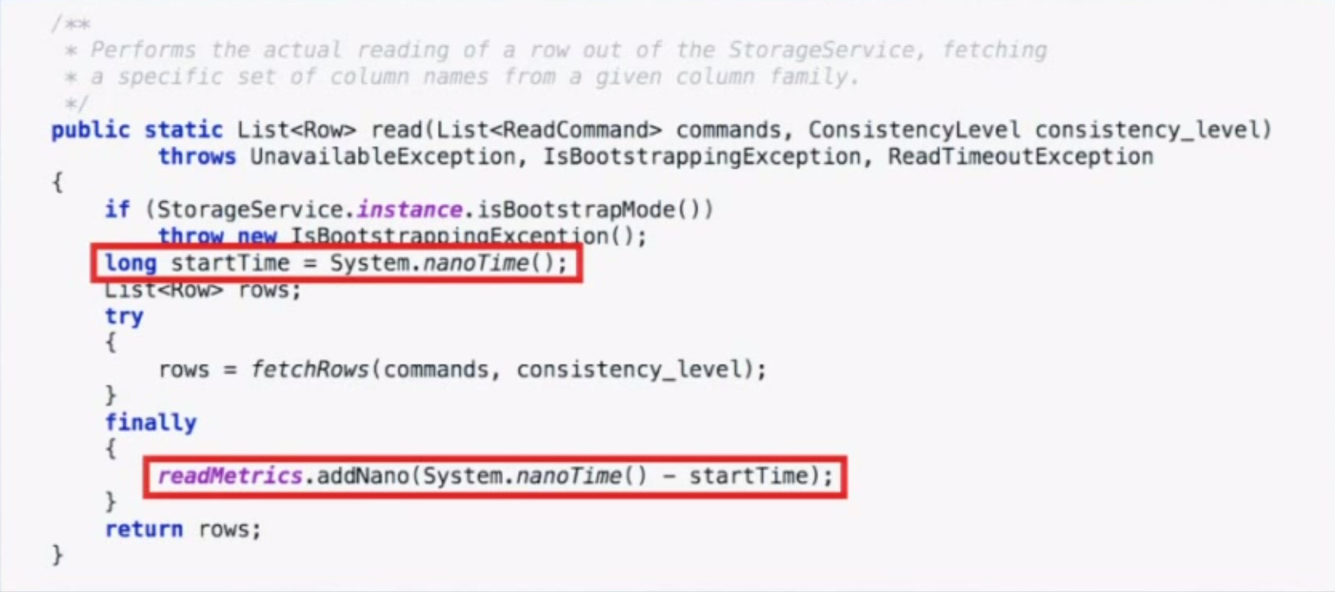
However, if the system experiences one of the “hiccups” described earlier, you will only have one bad operation and 10,000 other operations waiting in line. When those 10,000 other things go through, they will look really good when in reality the experience was really bad. Long operations only get measured once, and delays outside the timing window don’t get measured at all.
In both of these examples, we’re omitting data that looks bad on a very selective basis, but just how much of an impact can this have on benchmark results? It turns out the impact is huge.
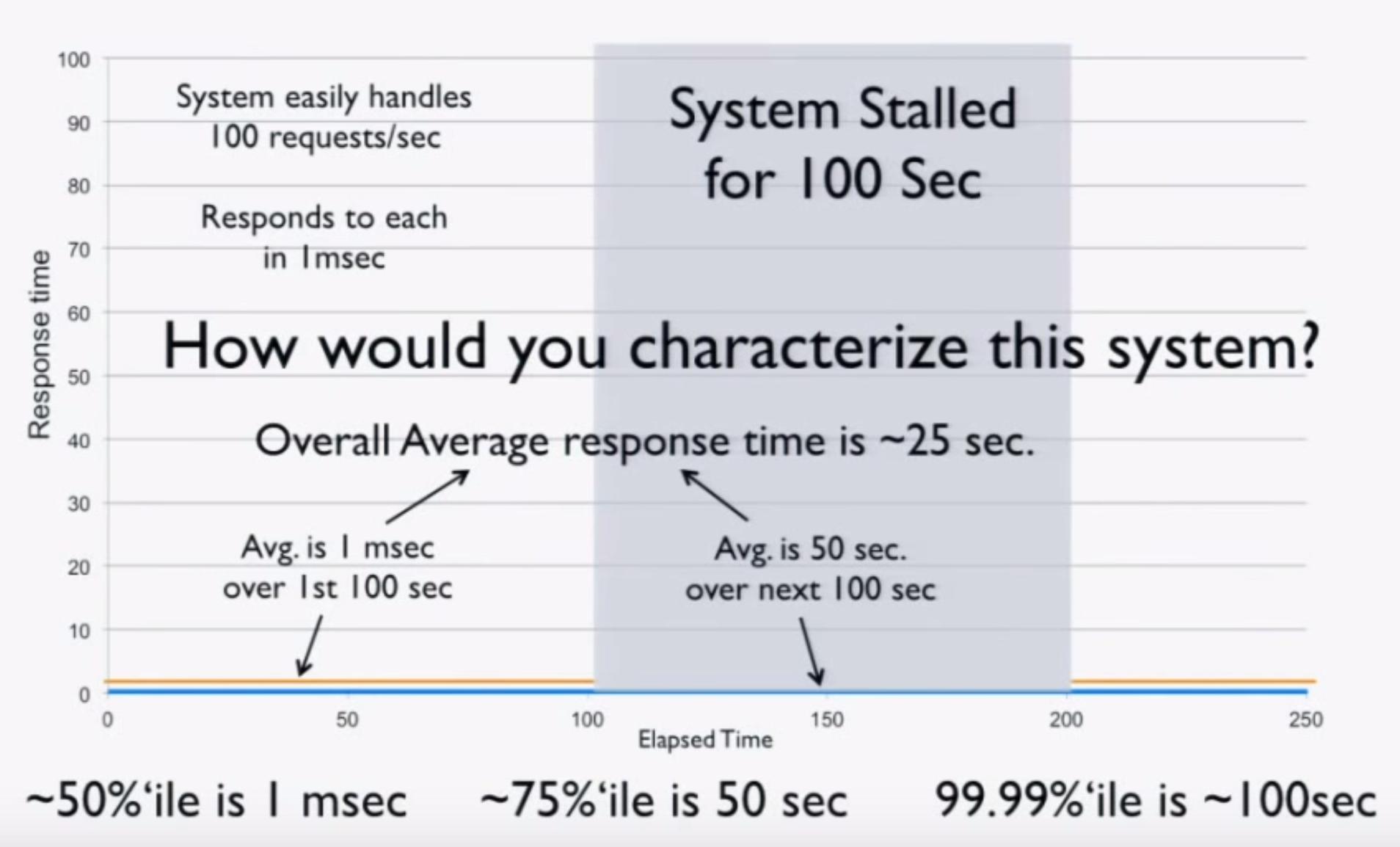
Imagine a “perfect” system which processes 100 requests/second at exactly 1 ms per request. Now consider what happens when we freeze the system (for example, using CTRL+Z) after 100 seconds of perfect operation for 100 seconds and repeat. We can intuitively characterize this system:
- The average over the first 100 seconds is 1 ms.
- The average over the next 100 seconds is 50 seconds.
- The average over the 200 seconds is 25 seconds.
- The 50th percentile is 1 ms.
- The 75th percentile is 50 seconds.
- The 99.99th percentile is 100 seconds.
Now we try measuring the system using a load generator. Before freezing, we run 100 seconds at 100 requests/second for a total of 10,000 requests at 1 ms each. After the stall, we get one result of 100 seconds. This is the entirety of our data, and when we do the math, we get these results:
- The average over the 200 seconds is 10.9 ms (should be 25 seconds).
- The 50th percentile is 1 ms.
- The 75th percentile is 1 ms (should be 50 seconds).
- The 99.99th percentile is 1 ms (should be 100 seconds).
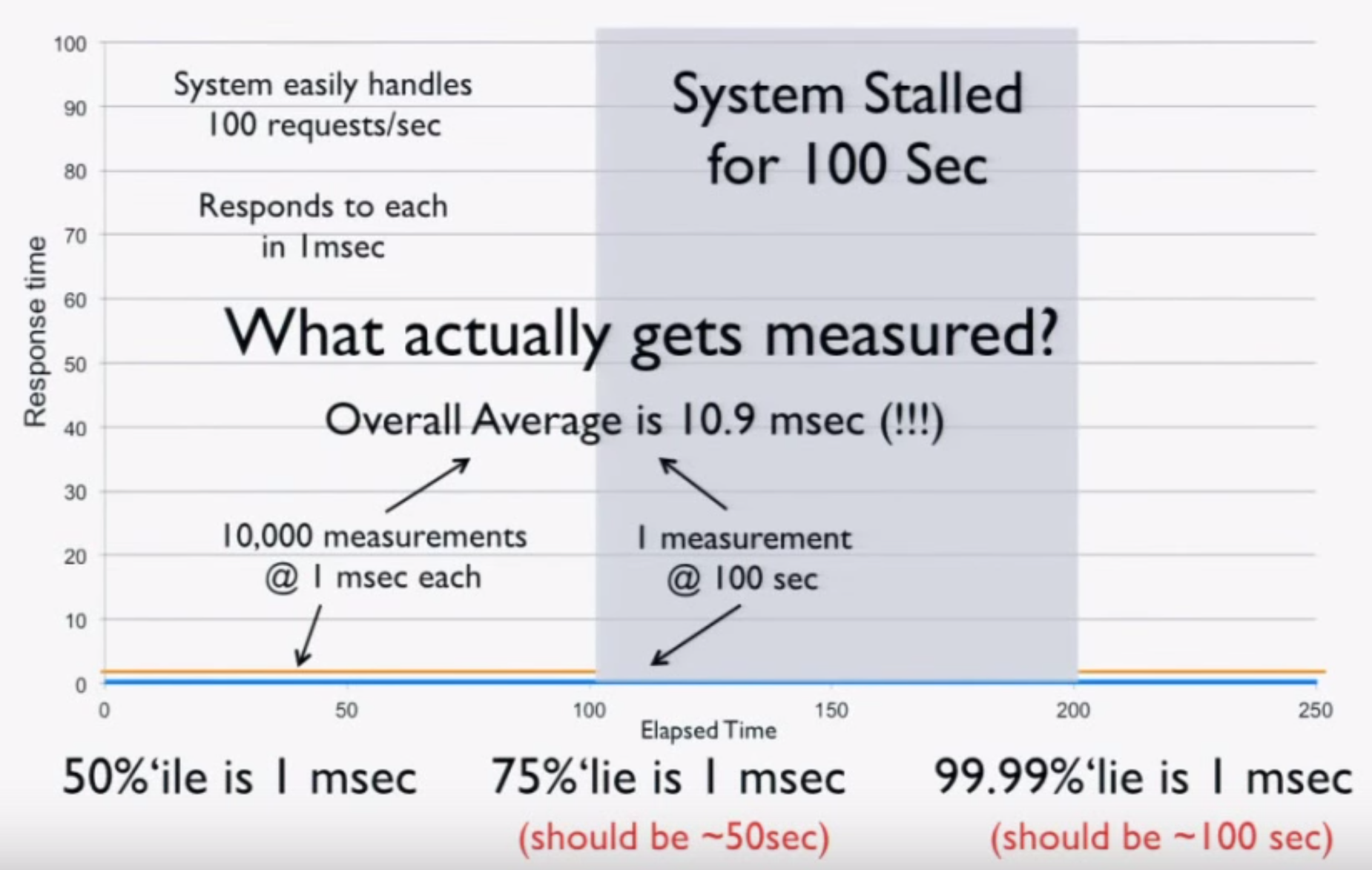
Basically, your load generator and monitoring code tell you the system is ready for production, when in fact it’s lying to you! A simple “CTRL+Z” test can catch coordinated omission, but people rarely do it. It’s critical to calibrate your system this way. If you find it giving you these kind of results, throw away all the numbers—they’re worthless.
You have to measure at random or “fair” rates. If you measure 10,000 things in the first 100 seconds, you have to measure 10,000 things in the second 100 seconds during the stall. If you do this, you’ll get the correct numbers, but they won’t be as pretty. Coordinated omission is the simple act of erasing, ignoring, or missing all the “bad” stuff, but the data is good.
Surely this data can still be useful though, even if it doesn’t accurately represent the system? For example, we can still use it to identify performance regressions or validate improvements, right? Sadly, this couldn’t be further from the truth. To see why, imagine we improve our system. Instead of pausing for 100 seconds after 100 seconds of perfect operation, it handles all requests at 5 ms each after 100 seconds. Doing the math, we get the following:
- The 50th percentile is 1 ms
- The 75th percentile is 2.5 ms (stall showed 1 ms)
- The 99.99th percentile is 5 ms (stall showed 1 ms)
This data tells us we hurt the four nines and made the system 5x worse! This would tell us to revert the change and go back to the way it was before, which is clearly the wrong decision. With bad data, better can look worse. This shows that you cannot have any intuition based on any of these numbers. The data is garbage.
With many load generators, the situation is actually much worse than this. These systems work by generating a constant load. If our test is generating 100 requests/second, we run 10,000 requests in the first 100 seconds. When we stall, we process just one request. After the stall, the load generator sees that it’s 9,999 requests behind and issues those requests to catch back up. Not only did it get rid of the bad requests, it replaced them with good requests. Now the data is twice as wrong as just dropping the bad requests.
What coordinated omission is really showing you is service time, not response time. If we imagine a cashier ringing up customers, the service time is the time it takes the cashier to do the work. The response time is the time a customer waits before they reach the register. If the rate of arrival is higher than the service rate, the response time will continue to grow. Because hiccups and other phenomena happen, response times often bounce around. However, coordinated omission lies to you about response time by actually telling you the service time and hiding the fact that things stalled or waited in line.
Measuring Latency
Latency doesn’t live in a vacuum. Measuring response time is important, but you need to look at it in the context of load. But how do we properly measure this? When you’re nearly idle, things are nearly perfect, so obviously that’s not very useful. When you’re pedal to the metal, things fall apart. This is somewhat useful because it tells us how “fast” we can go before we start getting angry phone calls.
However, studying the behavior of latency at saturation is like looking at the shape of your car’s bumper after wrapping it around a pole. The only thing that matters when you hit the pole is that you hit the pole. There’s no point in trying to engineer a better bumper, but we can engineer for the speed at which we lose control. Everything is going to suck at saturation, so it’s not super useful to look at beyond determining your operating range.
What’s more important is testing the speeds in between idle and hitting the pole. Define your SLAs and plot those requirements, then run different scenarios using different loads and different configurations. This tells us if we’re meeting our SLAs but also how many machines we need to provision to do so. If you don’t do this, you don’t know how many machines you need.
How do we capture this data? In an ideal world, we could store information for every request, but this usually isn’t practical. HdrHistogram is a tool which allows you to capture latency and retain high resolution. It also includes facilities for correcting coordinated omission and plotting latency distributions. The original version of HdrHistogram was written in Java, but there are versions for many other languages.
To Summarize
To understand latency, you have to consider the entire distribution. Do this by plotting the latency distribution curve. Simply looking at the 95th or even 99th percentile is not sufficient. Tail latency matters. Worse yet, the median is not representative of the “common” case, the average even less so. There is no single metric which defines the behavior of latency. Be conscious of your monitoring and benchmarking tools and the data they report. You can’t average percentiles.
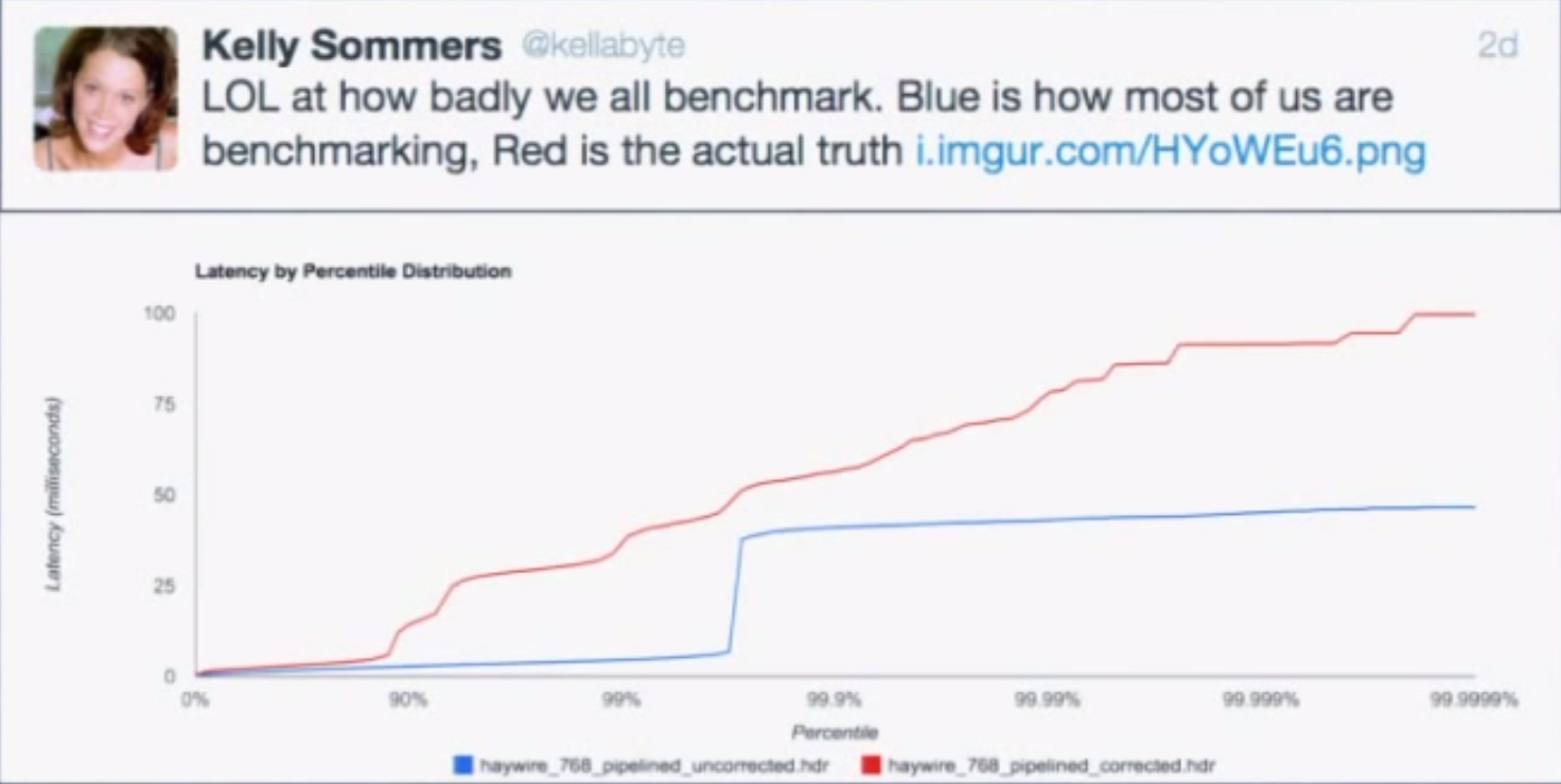
Remember that latency is not service time. If you plot your data with coordinated omission, there’s often a quick, high rise in the curve. Run a “CTRL+Z” test to see if you have this problem. A non-omitted test has a much smoother curve. Very few tools actually correct for coordinated omission.
Latency needs to be measured in the context of load, but constantly running your car into a pole in every test is not useful. This isn’t how you’re running in production, and if it is, you probably need to provision more machines. Use it to establish your limits and test the sustainable throughputs in between to determine if you’re meeting your SLAs. There are a lot of flawed tools out there, but HdrHistogram is one of the few that isn’t. It’s useful for benchmarking and, since histograms are additive and HdrHistogram uses log buckets, it can also be useful for capturing high-volume data in production.
Comments
Comments are from this blog's WordPress era and are preserved read-only.
Fantastic piece. One of the best I’ve ever read about metrics. It’s also something I am always advocating: do not pay attention to “averages” in chaotic systems.
What you plotted in the histogram is possibly a Power Law distribution. And as you also concluded, thus kind of distribution does not have an average and it does not have any standard deviation.
More profound than that: real life has no averages.
Power law may or not have an average or a standard deviation depending on the value of the exponent, don’t generalize.
While the table is interesting, it makes somehow a very dangerous assumption, that the latency events are independent, while the last example and even the rest of the text shows that this is *not* true at all. Latency values are never uniformly distributed, nor independent, concretely it means that the values shown in the table are probably extremely pessimistic for real systems, i.e you will have less cases of seeing the 99.99.. percentile because these long latencies will affect will be present more than once for the same request.
I was responsible for reducing latency of a “low-latency trading system”, so I find this article quite interesting. It takes quite a lot of analysis and measurement to understand why outliers occur, and a good deal of brain-sweat to find ways to avoid them.
In the system I worked on, I was successful in dropping average latency from 40ms down to 4usec, though there were still ocassional outliers — mainly due to the system not running on a RTOS.
Can’t say I was able to follow all the statistical calculations. If math is correct here, this is truly mind blowing.
The sites table is a crystal clear example to illustrate the mind set we should come up with when benchmarking.
Excellent article,
Thank you.
This is the sort of article ACM Queue is looking for, for their series “You don’t Know Jack About ”
Paul Stachour and I did one on Maintenance many moons ago, that got reprinted in the widely-distributed Communications of the ACM.
davecb@spamcop.net
… at http://cacm.acm.org/magazines/2009/11/48444-you-dont-know-jack-about-software-maintenance/fulltext
Looking at this as a queueing network with a steady stream of requests coming in, the real latency vs load curve starts off level, and then when the system wedges, takes a sharp turn upward, with each additional incoming unit of load making the line go upward at a sharp angle. This is the oft-mentioned “hockey-stick curve”, which looks like “_/” when plotted.
In your perfect system example, are there some implicit assumptions we’re missing? What is the rate with which requests arrive to the system? If it is 100 reqs/sec (equal to the service rate), then wouldn’t the average latency for the period 100-200 seconds be equal too 100 sec + 1ms? (And in fact, wouldn’t that be the latency for every request during that period, assuming a FIFO queue?) Can you explain how “the average over the next 100 seconds is 50 seconds”? Also how the average from 200 seconds onwards drops to 1ms again? I think I’m operating on a different (wrong ) set of assumptions. Thank you.
Good article and very good blog, thanks.
Very interesting read. On a side note, what software would you recommend for percentile graphing? I’m trying to sketch a migration path to better performance metrics graphing, but it seems there’s not a lot of systems that would be up to this task.
Circonus and IRONdb both support complete histograms collection over time allowing for arbitrary percentile calculation. Circonus (SaaS) is free up to 500 data streams. IRONdb (software) is free up to 25k data streams. You can use Grafana to interface with both to draw graphs.
If your looking to monitor graphs with global percentiles I would recommend beeinstant.com
Thanks for the great blog post, Tyler! I would like to recommend https://beeinstant.com to capture the entirety of latency data. You’ll see the full distributions of metrics being aggregated globally from multiple sources (like servers, containers) in real-time.
Disclaimer: I’m the founder of BeeInstant.com
How was the answer to:
“How many users will not experience something worse than the 95th percentile?”
got to 0.003%?
Thanks
I see, it’s the same formula 100 – (1-(.95^200))*100
Given a user-session has 5 page loads, averaging 40 individual resources per page-load, there are ~200 individual resources being loaded.
The chances of ALL those 200 resource requests in a session “avoiding” the 95%’lie is (0.95 ^ 200) * 100%, which is 0.003%. I.e only 0.003% of user sessions will not experience worse than 95’lie.
IOW, Suppose we have the latency distribution of individual resource types hence know 95%’lie latency of each – then a user session (loading ~200 resource instances of these resource types) has a 99.997% (100-0.003)% chance to experience 95%’lie latency for least one of the resource types.
As shown in the example, given it’s common to experience 95%’lie of individual resource type latency distribution, when doing latency measurement of such resource types, we have to focus on extremes (95%’lie, 99%’lie, 99.9%’lie).
“The median is the number that 99.9999999999% of response times will be worse than”
^^^ this is not correct. By definition the median is the 50th percentile, ie. 50% of response times are worse.
What you mean to say is:
“In our scenario (five page loads, averaging 40 resources per page), a user will have a 99.9999999999% chance of experiencing a response time worse than the median for one of the resources they request”.
Thank you for sharing these excellent insights.
A minor comment on the sentence “The response time is the time a customer waits before they reach the register.” This equates response time to waiting time. Using the same analogy, response time should be the time delta between a customer’s arrival time & service completion time. So response time is service time + waiting time + any other additional delay due to preemption/context switching. At least that is what my Queuing Theory class thought me :)
I think that even more interesting and important is to know where in your chain you have latencies and how much they impact the perveived performance.
A small latency in a network connection could have a major impact on UI responsiveness if there are a lot of small data transactions in place to draw your information in the UI.
The same is also true if you have a multi-layered application where the business logic communicates with the database server over a network. If you let the database engine perform the data sifting in a single database call or if you have the business logic do it and utilize multiple small database calls. A change from 4 to 20ms in network latency can cause quite some issues.
Even cloud services like OneDrive is sensitive to latency and it can result in some headaches.
I’m having troubles in understanding that math.
If there is just one HTTP request per page access, then, according to that formula, only 1% of page loads hit 99%ile. This sounds odd.
I think Tyler have a problem not with benchmarking, but with terminology.
Quote:
Before freezing, we run 100 seconds at 100 requests/second for a total of 10,000 requests at 1 ms each. After the stall, we get one result of 100 seconds. This is the entirety of our data, and when we do the math, we get these results:
The average over the 200 seconds is 10.9 ms (should be 25 seconds).
The 50th percentile is 1 ms.
The 75th percentile is 1 ms (should be 50 seconds).
The 99.99th percentile is 1 ms (should be 100 seconds).
Now, what is the definition of “average”? “In ordinary language, an average is a single number taken as representative of a list of numbers, usually the sum of the numbers divided by how many numbers are in the list (the arithmetic mean).”
What about percentile? “In statistics, a k-th percentile (percentile score or centile) is a score below which a given percentage k of scores in its frequency distribution falls (exclusive definition) or a score at or below which a given percentage falls (inclusive definition). For example, the 50th percentile (the median) is the score below which (exclusive) or at or below which (inclusive) 50% of the scores in the distribution may be found.”
Therefore, 10100 / 10001 is 1,0098.
75th percentile – is a mark between 7500 and 7501 value, which is, again, 1ms
99,99th percentile is a mark between 9999 and 10000 value, which is, again, 1ms
I fail to understand why exactly do these numbers should be different? Why does average “should be 25 seconds”? If it will be 25 seconds, it will no longer be average, it will be some other form of statistical calculation. Same goes for “75% percentile should be 50 seconds” – no, it should not. It’s a percentile. If you think it “should” be 50 seconds, then you’re not talking about percentiles, you talking about something completely different.
“Cache invalidation and naming things” all the way, all the way…
This article is a clear example of why it is important to use PROPER terminology at all times.
Furthermore, statement that “averaging percentiles is mathematically absurd” is technically absurd. Percentile is a number. Take a set of numbers, summarise it, divide by the number of elements in the set, and you have an average of percentiles.
Let’s say, you have a set of 95% percentiles, each spanning a period of 1s: [212, 234, 201, 255, 198, 920, 207, 181, 199, 201]. What would be 95% percentile of this set? It is 255. Sum of all values is 2808, average value is 280. Did we just… we did not! Did we?? Whoa, we have just averaged the percentiles! Was is absurd? Well, no, it was a _technically_ and _mathematically_ correct calculation. Is it meaningful, though? Well, to answer that question, you have to also answer if a 95-percentile is meaningful. Or if median is meaningful. Or if min/max are meaningful.
Meaningfulness in this case is defined by what information do you want to observe VS what information are you actually observing. Knowing that there is 547 birds in that big flock over there might be meaningless for you, but meaningful for ornithologist. Yet none of that means that calculating number of birds in the flock is “absurd”, or even, what a bold statement! “mathematically absurd”.
Now, the important part here is, again, “absurd” and “meaningless” are NOT synonyms nor they are interchangeable terms. Terminology matters. No, not like that, sorry. TERMINOLOGY MATTERS. Now, that’s better.
Author, before ranting on the subject, should first figure out WHAT he wants to see, HOW it should be represented, and what mathematical permutations and calculations should be done to achieve it. And NAME it PROPERLY.
Saying that 10100 divided by 10001 should be 25 is the most absurd thing I have seen on the internet today.
Do not ever mention this to a mathematician, else you may find yourself in a mental ward quite, quite promptly.
It’s an interesting article. However there’s a catch:
It’s important to note that most resources on a page are static, served from a CDN much faster than the page they are contained in. They will not suffer anything near the same latency as the main resource which is most times dynamic and slower; also most of these resources are much less impactful on user experience, many of them for instance are below the fold or only have a slight visual effect if at all.
Hence an interesting 95th or 99th percentile is usually measured for the main page HTML or the page HTML plus any blocking resources, or the onLoad client event – which denotes a point in the user experience. Not for all resources on the page.
So, although mathematically the article is correct and intriguing, having 40 resources on page doesn’t mean they’ll all have the same latency distribution nor the same impact on user experience – and hence shouldn’t be measured together.
Meaning, looking at the 99th percentile of the main page load time for example, or the start of rendering – WILL look at a per-page metric, and hence does measure what 99% of users will experience on a single page load.